ADVANCED TYPOGRAPHY | PROJECT 2

08/10/18 - 01/11/18 (Week 7 - Week 10)
Yeoh Xiao Shi (0331577)
Advanced Typography
Project 2
LECTURE
Lecture 7 : Type Design Methodology
08/10/18 (Week 7)
In this week class, one of the group were assigned to give a lecture on Type Design Methodology which is basically all about the way we use to research and create our our fonts. We were told that there are total 5 steps in type design methodology which included creating a brief, sketching, digitising, testing as wells as name and format the fonts or typefaces. We were then introduced to glyphs and the 8 special characters : dashes, ellipsis, bullet, copyright & trademark, quotes, primes, degree and arithmetic symbols. Lastly, we learned about kerning, spacing between two letters. It is important for the readability and legibility of the text. After the lecture, both of the lecturers went through all of our work for project 1 as to finalise it before moving on to project 2.
Here is the compilation of the slides for this week lecture below.
Embedded PDF of week 7 lecture slides.
Lecture 8 : No Lecture (Poster Design)
15/10/18 (Week 8)
There are no any lecture in this week class. Instead, both of the lecturers began the class by checking on our poster design. With the feedbacks given, we would need to amend it as well as to finalise the design of the poster by today.
Lecture 9 : Typographic Perception & Organisation
22/10/18 (Week 9)
This week, another group were assigned to conduct a lecture on Typographic perception and organisation. They have explained on different typographic variables that will affect the reader's perception which include form and content, gestalt psychology, layout as well as creating a visual hierarchy.
From the lecture, I got to understand that form refers to the style, techniques and media used while content is a work's subject matter and both of them are used to complement each other when applying in typography. Gestalt is the way that a thing has been placed together and it emphasised the whole of anything is greater than its parts. Besides that, there are total 9 was of perceptual organisation which consists laws of similarity, law of continuity, law of pregnant, law of proximity, law of closure, law of symmetry, law of common fate, law of common region and law of past experience. For layout, it is said to be the overall appearance and arrangement of the page. It can be created with spacing, grids, balance, bullet and number lists as well as the figures and tables. Lastly, visual hierarchy is used to provide a visual guide to the organisation. Without hierarchy, the letters, words and sentences would all look identical. This makes the readers can't scan the content and read easily.
From the lecture, I got to understand that form refers to the style, techniques and media used while content is a work's subject matter and both of them are used to complement each other when applying in typography. Gestalt is the way that a thing has been placed together and it emphasised the whole of anything is greater than its parts. Besides that, there are total 9 was of perceptual organisation which consists laws of similarity, law of continuity, law of pregnant, law of proximity, law of closure, law of symmetry, law of common fate, law of common region and law of past experience. For layout, it is said to be the overall appearance and arrangement of the page. It can be created with spacing, grids, balance, bullet and number lists as well as the figures and tables. Lastly, visual hierarchy is used to provide a visual guide to the organisation. Without hierarchy, the letters, words and sentences would all look identical. This makes the readers can't scan the content and read easily.
Here is the compilation of the slides for this week lecture below.
Embedded PDF of week 9 lecture slides.
INSTRUCTIONS
PROJECT 2
Typosexual Typographic Exhibition - Collateral (Week 7 - Week 10)
Week 7 (08/10/18)
This week, Mr Vinod gave us a brief on our second project which we will need to use the key artwork developed in the previous week across three different collaterals. We were required to design a poster, an e-invite and anything of our choice for the collaterals.
For the first part of this project, we were told to create a poster with the key artwork as well as the content provided in the first exercise. The requirements for the size of the poster is vertical A3 and it could have a narrow which means we can change the width but not the height of the poster. While designing the poster, we would also need to apply the typographic systems which learned in the previous class. The poster should be design in black and white first and develop it in colour later on.
 |
| Fig.1.1: Key artwork. |
 |
| Fig.1.2: Process of designing poster with key artwork. (first attempt) |
 |
| Fig.1.3: Process of designing poster with key artwork (first attempt) |
 |
| Fig.1.4: Outcome for the first attempt. |
After completing design the poster, I got the feedback that there is lack of hierarchy in the information as the texts are all in the same font weight and same direction. I was also told that the overall design is lack of readability and legibility. To create hierarchy, I have to use different font weight for the text to emphasis the important messages so that the audience will know what to read first. Next, Mr Shamsul suggested me to increase the space between the texts or place the text in different direction instead of all texting downwards. The placement of the texts should show the direction for the audience to know which one to read next. I would also need to apply the typographic system which learned in the previous class in the poster.
 |
| Fig.1.5: Process of editing after feedback given. (second attempt) |
 |
| Fig.1.6: Outcome for the second attempt. |
Once I done with the first design, I decided to explore it with different designs and I managed to create two compositions for each of the design. The photos below shown the progress and the outcome of my explorations.
 |
| Fig.1.7: Exploring with different design. (third & fourth attempt) |
 |
| Fig.1.8: Outcome for the third attempt. |
 |
| Fig.1.9: Outcome for the fourth attempt. |
 |
| Fig.1.10: Exploring with different design. (fifth & sixth attempt) |
 |
| Fig.1.11: Outcome for the fifth attempt. |
 |
| Fig.1.12: Outcome for the sixth attempt. |
In this week class, we got to show our poster design to both of our lecturers for some feedbacks. I was told to print out the poster that I think it could work in A3 paper so that they could have a better look at it as the outcome on the paper will looks differently from the screen. After looking at my design, Mr Vinod commented that the point size for the content looks too big so I would need to reduce it to the point size of 12. While placing the line as divider in the middle of the content, he asked me to start it with the same height of the content and lengthen the line. Besides that, I would need to leave a bigger space between the key artwork and boarder if I want to have a gap there. He also told me to develop my design with colour once I complete adjusting the composition.
 |
| Fig.2.1: Poster design chosen for further developing. |
 |
| Fig.2.2: Process of editing after feedback given. |
 |
| Fig.2.3: Final Outcome. (B&W) |
 |
| Fig.2.4: Process of adding colour to the poster. |
 |
| Fig.2.5: Final Outcome. (Colour) |
 |
| Fig.2.6: Process of editing the mock up. |
 |
| Fig.2.7: Poster mock up. |
Embedded PDF of first collateral : poster. (final)
Move on to the second part of this project, we were required to design any collaterals with the key artwork based on our choice. For me, I decided to explore it with different collaterals like badge, tote bag, brochure, notepad and so on.
 |
| Fig.2.8: Process of designing the back of the badge. |
 |
| Fig.2.9: Process of designing the front of the badge with key artwork. |
 |
| Fig.2.10: Process of designing the front of the badge with key artwork. |
| Fig.2.11: Design of the badge. |
 |
| Fig.2.12: Final Outcome of the badge. |
 |
| Fig.2.13: Process of designing the brochure. mock up from #anthonyboydgraphics |
 |
| Fig.2.14: Process of designing the brochure. |
 |
| Fig.2.15: Design of the brochure. |
 |
| Fig.2.16: Final outcome of the brochure. |
 |
| Fig.2.17: Process of designing the tote bag. |
 |
| Fig.2.18: Process of designing the tote bag. |
 |
| Fig.2.19: Design of the tote bag. |
 |
| Fig.2.20: Final Outcome of the tote bag. |
 |
| Fig.2.21: Process of designing the ID card holder. |
 |
| Fig.2.22: Process of designing the ID card holder. |
 |
| Fig.2.23: Design of the ID card holder. |
 |
| Fig.2.24; Final Outcome of the ID card holder. |
 |
| Fig.2.25: Process of designing the notepad. |
 |
| Fig.2.26: Design of the notepad. |
 |
| Fig.2.27: Final outcome of the notepad. |
 |
| Fig.2.28: Poster and other collaterals design. |
This week, Mr Vinod gave us a clearer brief on what we have to do for different items that we chose as the second medium. As for me, I have chose the badge for further developing. Thus, I would need to come out with four designs for the badges with the size of 3.2 cm or 5.8 cm. After looking at my first two design for the badge, Mr. Vinod told me to break the key artwork and experiment with different compositions so that the design doesn't look like copy and paste from the poster. With the feedback given, I continue to develop the badge with few more designs.
 |
| Fig.3.1: Process of further developing. |
| Fig.3.2: Designs of the badge. |
 |
| Fig.3.3: Process of mockuping the badges. |
| Fig.3.4: Mockup for the badges. |
 |
| Fig.3.5: Final Outcome of the badges. (1&2) |
 |
| Fig.3.6: Final Outcome of the badges. (3&4) |
Embedded PDF of second collateral : badges. (final)
 |
| Fig.3.7: Printed Badges. (top view) |
 |
| Fig.3.8: Printed Badges. (side view) |
 |
| Fig.3.9: Printed Badge. (Design 1) |
 |
| Fig.3.10: Printed Badge. (Design 2) |
 |
| Fig.3.11: Printed Badge. (Design 3) |
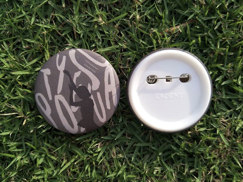 |
| Fig.3.12: Printed Badge. (Design 4) |
 |
| Fig.3.13: Framed poster. |
Week 9 (25/10/18)
In the same week, we were given a brief on the third collateral which we were required to create a microsite for Typosexual Typography Exhibition in Interactive Design class. To start off this project, I do some wireframe sketches as well as to choose a colour theme and font for it. After that, I move on to design the layout of the microsite in Adobe Illustrator so that it would be easy for me to code as I already know how I want it to be looked like. With the layout design done, I proceed to code in Adobe Dreamweaver.
 |
| Fig.4.1: Wireframe sketches. |
 |
| Fig.4.2: Selection of colour theme and font. |
 |
| Fig.4.3: Contents to be included in microsite. |
 |
| Fig.4.4: Process of designing the layout at Illustrator. |


Fig.4.5 & 4.6: Outcome of the layout.
 |
| Fig.4.7: Process of coding in Dreamweaver |
 |
| Fig.4.8: Preview of outcome at browser. |
 |
| Fig.4.9: Preview of outcome at browser. |
 |
| Fig.4.10: Preview of outcome at browser. |
 |
| Fig.4.11: Preview of outcome at browser. |
Week 10 (01/11/18)
This week will be the submission day for our third collateral but it was then extended to this Sunday since most of us could not manage to complete it. Thus, I continue to work on the microsite as there are still some problems I have to fix.
To view more for the process on creating the microsite CLICK HERE !
To view the microsite CLICK HERE !
To view more for the process on creating the microsite CLICK HERE !
To view the microsite CLICK HERE !
 |
| Fig.5.1: Process of editing the code in Adobe Dreamweaver. |
 |
| Fig.5.2: Overview of microsite at browser. |
Embedded PDF of third collateral : microsite.
This week, I got to received some feedbacks for my microsite in Interactive Design class. Mr Shamsul said the microsite was good but I have to add more words for the 'about section' so that it doesn't looks so empty. While for the 'featured products' section, I was told that the word on the image is not legible and I need to amend it. With the feedbacks received, I move on to make some changes for the code in Adobe Dreamweaver. Hence, here are some of the progress below.
 |
| Fig.6.1: Process of adding words for 'about' section. |
 |
| Fig.6.2: Process of amending 'featured products' section. |
 |
| Fig.6.3: 'about' section before amending. |
 |
| Fig.6.4: 'about' section after amending. |
 |
| Fig.6.5: 'featured products' section before amending. |
 |
| Fig.6.6: 'featured products' section after amending. |
 |
| Fig.6.7: Final outcome at browser. |
 |
| Fig.6.8: Final outcome at browser. |
 |
| Fig.6.9: Final outcome at browser. |
 |
| Fig.6.10: Final outcome at browser. |
 |
| Fig.6.11: Final outcome at browser. |
 |
| Fig.6.12: Overview of microsite at browser. (final outcome) |
Embedded PDF of third collateral : microsite. (final outcome)
Link to view my microsite (final) : http://xiiaoshi19.000webhostapp.com/new_microsite/
While in Advanced Typography class, we were told to arrange all our collaterals together. So, here are the three collaterals that I have done below.
 |
| Fig.6.13: My collaterals : poster, badges & microsite. |
Embedded PDF of all my collaterals : poster, badges & microsite.
FEEDBACK
Week 7
General Feedback : For the project 2, we were told to do it in Adobe Illustrator and InDesign. The size of the poster should be in A3 and could have a narrow which means we can resize the width but not the height of it. We were also told that all of the design for project 2 must have a visual consistency. Furthermore, we should not forget what we have learned in semester 1 and the previous week. Instead, we will need to apply all the knowledges we gain from previous exercise and project in it.
Specific Feedback : After looking at my key artwork for project 1, Mr Vinod said that he prefers the outcome for the fifth attempt while Mr Shamsul likes more for the first one. For the fifth attempt, I was told to make some changes by adjusting the text "typography exhibition" to make it looks better. When designing poster for project 2, Mr Shamsul asked me to ensure that the text of the content placing is readable. Besides that, I could make some of the important text bold to create hierarchy on it. He also suggested me to make the space between the two texts larger or maybe place the text in different direction instead of all texting downwards.
Week 8
General Feedback : When designing poster, we were told to use combination of typographic systems instead of one and we would need to think for the way to connect it with our key artwork so that it looks as a whole. Moreover, Mr Vinod told us to learn from the suggestion but not just to follow it because we can't learn from that way. The feedbacks given is just a hint so we would need to think and explore more by ourself.
Specific Feedback : For my poster design, Mr Vinod commented that the point size 15 for the content is too big and he suggested me to reduce it to the point size of 12. When placing the line as divider in the middle of the content, I was told to start it with the same height of the content. Furthermore, I would need to leave a bigger space between the key artwork and boarder if I want to have a gap there.
Week 9
General Feedback : When designing the second medium, we have to use the key artwork in different ways like extracting some parts of it or break it but maintain the consistency of it with the poster.
Specific Feedback : Mr Vinod told me to break the key artwork and play around with it so that it will not looks like copy and paste.
Week 10 (Feedback from Interactive Design class)
Specific Feedback : After looking at my microsite, Mr Shamsul and Mr Lun commented that overall was good but I could add in some images like poster if I want to. Other than that, I was told to upload the microsite to web hosting once I complete it.
REFLECTION
Experiences :
Week 7 : For this week, we were briefed on the second project which we will need to come out a poster with the key artwork created for the previous project.
Week 8 : In this week class, we would need to finalise our poster design and move on to the next part of this project which is designing any of the collaterals based on our choice. I enjoyed the time when applying the key artwork across different collaterals which I think is quite fun and interesting.
Week 9 : This week, I have chose one of the medium out from my explorations which is badge for further developing. In the same week, I got to create a microsite as one of the collateral for Typosexual and Typography Exhibition.
Week 10 : This week, I continue to work on with the microsite by fixing some problems that I still couldn't manage to figure it out. In order to find out, I did ask others for help.
Observations :
Week 7 : I realised that I neglect the importance of readability and legibility when designing the poster as I focus more on the design.
Week 8 : I observed that I would need to keep the colour, fonts and the style of collaterals similar to my poster design in order to create the consistency.
Week 9 : I noticed that I did maintain the consistency in my first attempt but I didn't manage to explore the key artwork in different ways so the overall design is lack of exciting.
Week 10 : I realised that more practices for coding is still needed for me as it would be tough if I don't understand and familiar with it. Overall, the process is considered challenging and time consuming but it's still satisfying after looking at the final outcome.
Findings :
Week 7 : I learned that it is important to ensure that the poster designed is readable and well-organised so that the message of the poster could convey clearly to the audience. In addition, hierarchy of the information is needed in a poster to help the audience received the messages faster by scanning it. In order to let the audience know where they should start reading, I would also need to consider the direction and placement of the text.
Week 8 : I found that consistency is important when comes to design the collaterals as it will give the event a personality and identity that others can relate to. Besides that, it also help to make the event stand out from others as well as to remind the target audience of your event.
Week 9 : I found that I could actually make the design more exciting by breaking the key artwork and use it with variations but not to limit myself with just one idea.
Week 10 : I found that asking others when facing the problems could help me to learn something rather than just exploring myself without understand it.
FURTHER READING (WEEK 7 - WEEK 10)
Week 7
 |
| Type Rules, Enhanced Edition : The Designer's Guide to Professional Typography By: Strizver, Ilene |
In this week, I have read on the chapter "Designing Your Own Typeface" from this book. It suggests that handwriting fonts will be the good place for us to begin designing our own typefaces as it will do nicely and maintain that personal, low-tech look. However, there are three approaches to design a typeface other than handwriting font. First, develop a fairly tight drawing of the typeface design before scanning and importing it into font-editor software. Later on, we can clean it up, add spacing and kerning, run text tests and also fine-tune. For this approach, we would requires to know how to draw pretty well but this is not necessarily a skill that beginner of the type designers have. Next, begin with a drawing or rough sketch for our concept or idea which is the method used commonly. Once complete with the sketch, we can fine-tune the typeface after scanning it. Developed the ability to conceptualise and actualise a concept on screen is also one of the approach to design a typeface since there are a lot of designers nowadays designing the entire typeface on the computer screen. Beginner of the type designers are not recommend to use this method because it said that the designer will leave all the design decisions and fine-tuning of shapes up to the quirks and personality of the drawing tools of the software combined with the limitations of their own skills.
Week 8 - Week 9
 |
| How to Use Type By: Marshall, Lindsey, Meacham & Lester |
Week 8
From this book, I have read about the visual continuity. According to the authors, it is a way of leading the reader or viewer through the design and the message it conveys, making clear which parts of the design relate to each other and thus enhancing the communication. This could be achieved by using the same typefaces for certain functions. For example, applying the same typefaces for chapter openings, colour-coding and consistent use of hierarchy. Frames and tables which may differentiate an area of type from the main body or create a visual link between two of more sections of text can be also help in visual continuity, support hierarchy as well as to draw attention to an aspect of the design. It is not necessary to have a boarder for frames as it can be distracting and creating unnecessary visual noise. This problem could be overcome by using very lightweight frames or tints.
Week 9
This week, I read about colour and movement from this book. The authors claimed that the used of imaginative colour on the type or its background can add the impact and meaning to the designs. The colours interact and react with each other like some work together and some fight each other and cancel each other out. So, considerations are needed when choosing the colours for type. In addition, background and any images also have to be considered when using as they will affect the colours used for the type. The way that colours work together may also affect the legibility of the type. However, some designers choose to make legibility difficult to grab audience's attention to the content. Besides that, the authors also discuss on how to make the most of colour like defining hierarchy, to create balance or contrast and to refer to the symbolic properties of certain shades with examples.
While for movement, the authors claimed that the term movement can mean actual moving type, either through animation on screen or means of mechanism to make physical, printed type alter in some way as well as how to create the illusion of movement in a static piece of printed work. The authors have given each example for the animated type on paper and screen. For animated type on paper, it is one of the simplest methods of simulating movement which produce a paper animation by placing a series of pictures in each page of a book that change gradually from the first to last page. For animated type on screen, sophisticated software that enable the designers to experiment with moving type for a range of screen-based contexts, from smartphone apps to TV ads have been used recently. It is said that the type designers basic principles of legibility and readability should not be forgotten although the production of moving type entails the acquisition or specialist technical or software skills. Other than that, movement can be also created or implied in a static type by the way the type is positioned in relation to the audience's viewpoint. This can be done by experiment with combinations of typefaces, point size, and type families.
Week 10
 |
| Typography Referenced : A Comprehensive Visual Guide to the Language, History, and Practice of Typography By: Haley, Allan |
From the chapter of contemporary usage, the authors claimed that the new generation of typographers have deliver the fonts at an alarming pace. As a result, the designers have a multiplicity from which to choose and they take greater liberties with letterforms, modifying them often with abandon, yet sometimes with great care. For centuries, type has been used for communicative, expressive, educational, and entertainment purposes. Contemporary designers continue this traditions, albeit through different approaches, technology, and aesthetics. Form may follow function and type can become an image. No matter what, the readers will still seek out the information and clarity, sometimes wanting merely visual entertainment and in some cases, wanting a spectacle instead of a message. In the book, the authors also included some examples of the inspirational ways that designers have used type as a primary means of design, an end unto itself-type as image, type as word, type as the ultimate communicator, from a and faction rolled into one.
Comments
Post a Comment