25/10/18 - 01/11/18 | Week 9 - Week 10
Yeoh Xiao Shi (0331577)
Interactive Design
Project 2 - Microsite
LECTURE
Lecture 9 : Briefing on Project 2
25/10/18 (Week 9)
There was no lecture for this week class. Instead, Mr Shamsul brief us on our second project which will be one of the collateral for Typography project 2. For this project, we were told that we are not going to do an E-invite which mentioned previously and it will be replaced with microsite instead. Before moving on to develop a microsite, we were given some times to find the definition and benefits of microsite so that we will have a better understanding on it.
Definition : Microsite is a website that separate from an organisation's main website, that delivers more focused and relevant content about a specific topic or to a targeted audience or even just requiring a defined action. It is hosted on its own domain and subdomain, and have a different URL than the URL of its company websites. It could be used for a product, a service, a timely promotion or an upcoming event.
Benefits :
Focus - It focus more easily on a specific topic, audience or action
Speed - With clearer focus and concise information, a microsite can be developed quickly
Declutters the homepage - Specific contents that individualised the microsite help to keep a homepage of the company clear and clutter. Thus, the user can connect more easily and engage more efficiently with the information that matters most to them.
Detailed information - Having a microsite that including all the pertinent details help the viewers to easily clarify and understand your proposals.
Ease of access - It is said to be easier for the viewers to remember when the microsite has its own URL that specific to your subject and slogan.
Lecture 10 : No Lecture (Submission of Microsite & Final Project Briefing)
01/11/18 (Week 10)
This week will be the submission day for our project 2 and there was no any lecture being conducted. Mr Shamsul began the class by asking us to register for free web hosting so that the microsite we posted onto the Internet can be viewed. Later on, Mr Shamsul and Mr Lun walked around to check on our microsite and give some feedbacks. Since most of us haven't completed the microsite, the due date was then extended to this Sunday. Briefing for the final project was also given this week for us to prepare for it before the next class.
INSTRUCTIONS
PROJECT 2
Typosexual Typographic Exhibition Collateral - Microsite
(Week 9 - Week 10)
Week 9 (25/10/18)
In this week class, we were given the brief on our second project which we were required to create a microsite as one of the collateral for Advanced Typography project 2. As to start this project, we were introduced to bootstrap which is an open source toolkit for developing with HTML, CSS and JS framework in order to build responsive and mobile-first projects on the web. A simple exercise was also given for us to familiar with it.
 |
| Fig.1.1: Coding navigation with bootstrap. |
 |
| Fig.1.2: Coding navigation with bootstrap. |
 |
| Fig.1.3: Coding navigation with bootstrap. |
 |
| Fig.1.4: Preview of outcome at browser. |
 |
| Fig.1.5: Preview of outcome at browser. |
 |
| Fig.1.6: Preview of responsive outcome. |
 |
| Fig.1.7: Preview of responsive outcome. |
After completing the exercise, we were told to start this project with some wireframe sketches as well as to choose a colour theme and font. While designing, we were told to ensure that our design for the microsite relates back to the key artwork and poster we did in Advanced Typography class so that it maintains the consistency. For my reference, I got to go through some visual references online. Once I done with that, I decided to design the layout of my microsite in Adobe Illustrator first by referring to the sketches. Thus, it would be easy for me when coding in Adobe Dreamweaver.
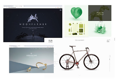 |
| Fig.1.8: References. |
 |
| Fig.1.9: References. |
 |
| Fig.1.10: Wireframe sketches. |
 |
| Fig.1.11: Selection of colour theme and font. |
 |
| Fig.1.12: Contents to be included in microsite. |
 |
| Fig.1.13: Process of designing the layout at Illustrator. |
 |
| Fig.1.14: Process of designing the layout at Illustrator. |
Fig.1.15 & 1.16: Outcome of the layout.
With the layout design done, I proceed to code in Adobe Dreamweaver.
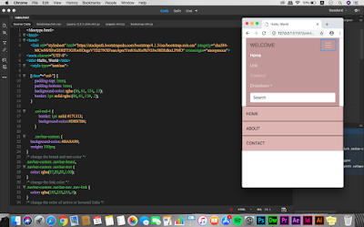
 |
| Fig.1.17: Process of coding at HTML file. |
 |
| Fig.1.18: Process of coding at HTML file. |
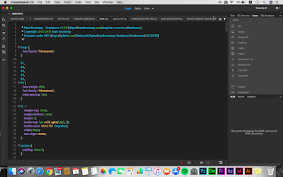 |
| Fig.1.19: Process of coding at CSS file. |
 |
| Fig.1.20: Process of coding at CSS file. |
 |
| Fig.1.21: Preview of outcome at browser. |
 |
| Fig.1.22: Preview of outcome at browser. |
 |
| Fig.1.23: Preview of outcome at browser. |
 |
| Fig.1.24: Preview of outcome at browser. |
 |
| Fig.1.25: Preview of responsive outcome. |
 |
| Fig.1.26: Preview of responsive outcome. |
Week 10 (01/11/18)
This week, Mr Shamsul and Mr Lun went through our microsite and give some feedbacks so that we can improve it before submitting. We were also told to upload our site to the web hosting once we complete so that it can be viewed on Internet. The submission date was extended to this Sunday since most of us didn't manage to complete it by the day. So, I continue to work on the microsite as there are still some problems I have to fix.
 |
| Fig.2.1: Process of editing the code at HTML file. |
 |
| Fig.2.2: Process of editing the code at CSS file. |
 |
| Fig.2.3: Process of editing the code. |
 |
| Fig.2.4: Process of editing the code. |
 |
| Fig.2.5: Preview of outcome at browser. |
 |
| Fig.2.6: Preview of outcome at browser. |
 |
| Fig.2.7: Preview of outcome at browser. |
 |
| Fig.2.8: Preview of outcome at browser. |
 |
| Fig.2.9: Preview of outcome at browser. |
 |
| Fig.2.10: Overview of microsite at browser. |
 |
| Fig.2.11: Preview of responsive outcome. |
 |
| Fig.2.12: Preview of responsive outcome. |
 |
| Fig.2.13: Preview of responsive outcome. |
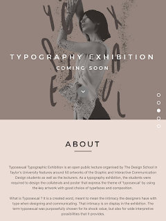
Week 13 (22/11/18)
In this week class, Mr Shamsul and Mr Lun went through our microsite and comment on it. Mr Shamsul said my design for the microsite was good but I have to add more words for 'about section' so that it doesn't looks so empty. While for the 'featured products' section, I was told that the word on the image is not legible and I need to amend it. With the feedbacks received, I move on to make some changes for the code in Adobe Dreamweaver.
 |
| Fig.3.1: Process of adding words for 'about' section. |
 |
| Fig.3.2: Process of amending 'featured products' section. |
 |
| Fig.3.3: 'about' section before amending. |
 |
| Fig.3.4: 'about' section after amending. |
 |
| Fig.3.5: 'featured products' section before amending. |
 |
| Fig.3.6: 'featured products' section after amending. |
 |
| Fig.3.7: Final outcome of the microsite at browser. |
 |
| Fig.3.8: Final outcome of the microsite at browser. |
 |
| Fig.3.9: Final outcome of the microsite at browser. |
 |
| Fig.3.10: Final outcome of the microsite at browser. |
 |
| Fig.3.11: Final outcome of the microsite at browser. |
 |
| Fig.3.12: Responsive outcome. |
 |
| Fig.3.13: Responsive outcome. |
 |
| Fig.3.14: Responsive outcome. |
 |
| Fig.3.15: Responsive outcome. |
 |
| Fig.3.16: Overview of microsite at browser. (final outcome) |
Embedded PDF of the microsite. (final outcome)
 |
| Fig.3.16: Microsite mockup. |
Embedded PDF of microsite mockup.
FEEDBACK
Week 9
General Feedback : While coding, we would need to have comments on top of the code for other people to understand what are we coding especially when we need others to replace and continue the work. Other than that, we were told to make sure the code is open with a opening tag and close with a closed tag to avoid deflect.
Specific Feedback : For my wireframe sketches, Mr Shamsul and Mr Lun commented that my design is quite modern but I was told that I could add in the expand menu if I want.
Week 10
General Feedback : Briefing for final project was given and we were told to discuss with our partner to know what they want for their website as well as to figure out the contents to be included in. Other than that, we were told to ready for the content, site map as well as mood board before the next class.
Specific Feedback : After looking at my microsite, Mr Shamsul and Mr Lun commented that overall was good but I could add in some images like poster if I want to. Other than that, I was told to upload the microsite to web hosting once I complete it.
Week 13
General Feedback : No general feedback given, continue to work on the final project.
Specific Feedback : For the project 2, I was told to add more words in "about" section so that it won't looks so empty. While for the "featured products" section, the words on the image is not legible so I have to make some changes for that.
REFLECTION
Experiences :
Week 9 : This week, I have learned about how to build a responsive website with bootstrap which is quite complicated and challenging for me. After that, I would need to create a microsite for Typosexual Typography Exhibition with the knowledges and experiences on coding I gained in the previous class.
Week 10 : For this week, I continue to work on fixing the microsite since there are some problems that I still couldn't manage to figure it out. Thus, I would need to ask others for help.
Observations :
Week 9 : This project is consider challenging for me since I still not really familiar with coding as well as bootstrap. Throughout the process, I also faced a lot of problems as the results previewed on the browser doesn't look like how I want it to be. Thus, I would need to make the changes in Adobe Dreamweaver again and again.
Week 10 : I realised that more practices for coding is still needed for me as it would be tough if I don't understand and familiar with it.
Findings :
Week 9 : I found that it is easier for me to code after creating the layout in Adobe Illustrator since I already have an idea on what I want my website to be look like.
Week 10 : I found that asking others when facing the problems could help me to learn something rather than just exploring myself without understand it.
FURTHER READING (WEEK 9 - WEEK 10)
Week 9
 |
Web Design 101, Chapter 6 : Designing for mobile.
By: John Moore Williams |
This week, I have read on the differences between responsive and adaptive design as well as how to craft content for mobile. Responsive web design (RWD) uses relative measurements like percentages and rems to ensure that the website we create responds to the device it's being viewed on. This means the website will remains the same but the content reflowed, reorganised and resized for a better mobile experience. Besides that, it also make maintenance and updates easier since we only have to make content and layout changes once, rather than six or more times. It is said that it is good to have responsive sites since it provides a consistent experience across different devices, easy to make maintenance and it is more future friendly. However, it is slower than the adaptive sites.
While for adaptive web design (AWD), it serves unique designs for different common screen widths. Thus, each design is like an adaptation of your core experience. It uses "breakpoint' which is a screen width that to decide which design the user will see instead of responding fluidly to the device someone is using to view our site. This allow us to customise our site for different contexts and offer more flexibility. The site which apply adaptive design will have faster performance and it is customisability for different devices. But, it brings inconvenient as there are too many devices to account for and no future proofing.
Other than responsive and adaptive web design, there are few things that we would need to keep in mind when designing and creating content for mobile. First, keep the navigation simple by highlighting the most important aspects of the site in main navigation and offer people paths to other pages through homepage content. Next, keep the content consistent so that the audiences will not get bored when reading through our website. In addition, cut the cruft from the website. For example, kill the popups that majority of us loathe to provide a user friendly experience.
Week 10
 |
Web Design 101, Chapter 9 : How to design landing pages that convert.
By : Neal O' Grady |
From this chapter, the author suggested 7 elements of high-converting landing pages. Firstly, the content of the landing pages should be detailed but concise copy. We need to be specific about what our product is, does, why it matters and how it will help the users that visited our site as people won't pay for something they don't understand. Moreover, a landing page should have a clear calls to action (CTAs). It has to be both visually prominent and clear in meaning, so that the visitor know what we expect them to do. In addition, used of genuine tone when writing the content for the site is also one of the elements that we should keep in mind. If the word we wrote sounding like a keyboard spewing robot , it may scare people away and make our product sound cheap. Other than that, we should used engaging content to grab the users attention and interest to our landing page. People may get bored and intimidated when reading large blocks of text. Thus, we would need to keep their attention with engaging and easy-to-read copy, lists, imagery and data visualisations. Furthermore, don't forget the social proof as well by highlight people that already enjoying the product with quotes, testimonials, facebook likes or case studies to gain the trust of the users. Next, we should carefully considered the price when selling something through landing page as even the relative size and position of a price can also influence the consumer behaviour. Lastly, designing landing ages in the right order is also consider important. It requires a well crafted and perfectly timed plan of attack.


Comments
Post a Comment