PUBLISHING DESIGN | PROJECT 2

Yeoh Xiao Shi (0331577)
Publishing Design
Project 2
LECTURE
Lecture 4 : Typography Redux
29/04/19 (Week 5)
This week, Mr Vinod began the class by giving us a lecture about Typography which is the most important area in graphic design to master. Through this lecture, we are able to revise what we have learned in the previous semester.
Typography is the art of arranging and composing text, it is also a medium for expression and most importantly communication. It plays a central role in any design work. If the goal when working with type is to make a body text more readable, then heeding established legibility guidelines is of utmost importance. Departure rom these "rules" should be attempted when the designer is totally familiarised with them, and when the content lends to expressive interpretation. As to achieve legibility, we need to choose text typefaces that are open and well proportional. For example, classical serif typefaces like Garamond, Bodoni, Minion Pro, Baskerville, Jenson, Caslon and the sans serif typefaces like Franklin Gothic, Frutiger, Gill Sans, Helvetica, Myriad Pro and more. Other than choosing the right typeface, they are also other aspects that we need to consider like special styles, type size, line length, line spacing, character, word space, alignment, paragraph indent and special formatting.
Embedded PDF of week 5 lecture slides.
INSTRUCTIONS
PROJECT 2
Book (Week 5 - Week 9)
Week 5 (29/04/19)
This week, we were introduced to our second project in which we were required to determine the format and layout based on a suitable grid system, choice of fonts and colors as well as to come out with a physical book.
To start off, we were instructed to find some visual references so that we could have a better idea of the layout we want for our book.
References :
 |
| Fig.1.1: Reference. |
 |
| Fig.1.2: Reference. |
 |
| Fig.1.3: Reference. |
 |
| Fig.1.4: Reference. |
 |
| Fig.1.5: Reference. |
Also, we were told to make a type specimen sheet and experiment with a few combinations of typefaces to determine the one that best suits the visual style of our book.
 |
| Fig.1.6: Type specimen sheet. |
 |
| Fig.1.7: Type specimen sheet. |
 |
| Fig.1.8: Type specimen sheet. |
 |
| Fig.1.9: Type specimen sheet. |
Embedded PDF of type specimen sheet.
Chosen typefaces :
- Header: Besom 26/30
- Body text: Raleway Regular 8/12
- Pull quote: Besom 11/15
- Subtext: Raleway Regular 7/11
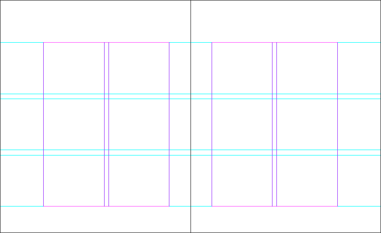
Besides that, we would also need to determine three possible grid systems based on the references found. Hence, here are the three grid systems developed within the dimensions of my book.
 |
| Fig.1.10: Grid system 1. |
 |
| Fig.1.11: Grid system 2. |
 |
| Fig.1.12: Grid system 3. |
Moving one from that, we were required to choose one of the grid system and apply the contents we did previously. For me, I have chosen the grid system 3 and proceed to experiment with the layout.
 |
| Fig.1.13: Process of experimenting the layout with grid system. (first attempt) |
 |
| Fig.1.14: Process of experimenting the layout with grid system. (first attempt) |
 |
| Fig.1.15: First attempt. |
 |
| Fig.1.16: First attempt. |
 |
| Fig.1.17: First attempt. |
 |
| Fig.1.18: First attempt. |
Week 6 (06/05/19)
In this week's class, I got to show the layout of my first attempt to Mr. Vinod and received lots of useful feedback from him. First, I was told not to focus on the colors first instead make the layout in black and white. Moreover, my text formatting is wrong and I need to correct it afterward. In regard to the typefaces, he told me not to use the same font for the header and pull quote as it will confuse the readers. With the feedback received, I continue to make the second attempt.
 |
| Fig.2.1: Process of experimenting the layout with grid system. (second attempt) |
 |
| Fig.2.2: Process of experimenting the layout with grid system. (second attempt) |
 |
| Fig.2.3: Second attempt. |
 |
| Fig.2.4: Second attempt. |
 |
| Fig.2.5: Second attempt. |
 |
| Fig.2.6: Second attempt. |
 |
| Fig.2.7: Second attempt. |
Week 7 (13/05/19)
This week, I manage to have a short consultation with Mr. Vinod to receive some feedbacks from him. He mentioned that I still make a mistake on the text formatting so I would need to edit it later. As for the pull quote, I was told to maintain its consistency by applying the same alignment. Other than that, he told me to take out the number of each chapter as people might think it is a page number. Overall, he said my layout is good but I can keep on working to achieve the great layout. After receiving the feedback, I proceed to make adjustments for the layout.
 |
| Fig.3.1: Process of editing after feedbacks given. (third attempt) |
 |
| Fig.3.2: Process of editing after feedbacks given. (third attempt) |
 |
| Fig.3.3: Third attempt. (black and white) |
 |
| Fig.3.4: Third attempt. (black and white) |
 |
| Fig.3.5: Third attempt. (black and white) |
 |
| Fig.3.6: Third attempt. (black and white) |
 |
| Fig3.7: Third attempt. (colour) |
 |
| Fig3.8: Third attempt. (colour) |
 |
| Fig3.9: Third attempt. (colour) |
 |
| Fig3.10: Third attempt. (colour) |
 |
| Fig3.11: Third attempt. (colour) |
 |
| Fig.3.12: Thumbnail of third attempt. (excluding front cover) |
 |
| Fig.3.13: Thumbnail of third attempt. (excluding front cover) |
As next week's class is a public holiday, we were instructed to print the book mock-up in black and white and show it to Mr. Vinod on Tuesday. Therefore, I go to the printing shop for printing once I completed the layout.
Here is my black mock-up below :
 |
| Fig.3.14: Black and white mock-up. (front cover) |
 |
| Fig.3.15: Black and white mock-up. (spread) |
 |
| Fig.3.16: Black and white mock-up. (spread) |
 |
| Fig.3.17: Black and white mock-up. (spread) |
 |
| Fig.3.18: Black and white mock-up. (spread) |
 |
| Fig.3.19: Black and white mock-up. (back cover) |
Week 8 (21/05/19)
This week, I got to show the black and white mock-up to Mr. Vinod and received feedback from him. He said that the layout is good and the book has its consistency now, but he also mentioned I could add one or two more pages of pull quotes in between to break the consistency. Other than that, I was told to come up with a book cover that has a great impact and make the book to stand out. With the feedback received, I also proceed to add the pull quotes and design the book cover.
Layout :
 |
| Fig.4.1: Process of adding pull quotes. |
 |
| Fig.4.2: Process of adding pull quotes. |
 |
| Fig.4.3: Fourth attempt. |
 |
| Fig.4.4: Fourth attempt. |
 |
| Fig.4.5: Fourth attempt. |
 |
| Fig.4.6: Fourth attempt. |
 |
| Fig.4.7: Fourth attempt. |
 |
| Fig.4.8: Thumbnail of fourth attempt. (excluding front cover) |
 |
| Fig.4.9: Thumbnail of fourth attempt. (excluding front cover) |
 |
| Fig.4.10: Thumbnail of fourth attempt. (excluding front cover) |
 |
| Fig.4.11: Process of designing the book cover. |
 |
| Fig.4.12: Process of designing the book cover. |
 |
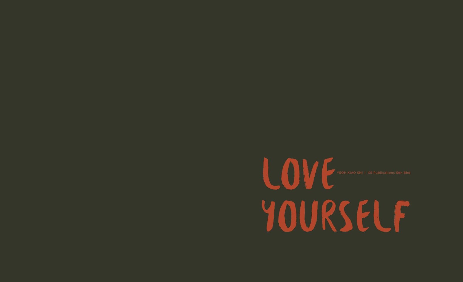
| Fig.4.13: Front &Back book cover 1. |
 |
| Fig.4.14: Front & Back book cover 2. |
 |
| Fig.4.15: Front & Back book cover 3. |
 |
| Fig.4.16: Front & Back book cover 4. |
Before printing, I got to finalised the book layout and book cover design with Mr. Vinod this week. He mentioned that the book cover design doesn't suit the style of my visuals as it looks too clean. So, he asked me to try adding one visual from the book to act as the background to see how it looks. While for the book content, I need to make some adjustments to the two pages of pull quotes to ensure the placement of the word in the center is still readable after staple binding. Once I received the feedback, I move on to alter the book layout as well as the book cover.
Layout :
 |
| Fig.5.1: Process of editing the layout of pull quotes. |
 |
| Fig.5.2: Process of editing the layout of pull quotes. |
 |
| Fig.5.3: Final attempt. |
 |
| Fig.5.4: Final attempt. |
 |
| Fig.5.5: Final attempt. |
 |
| Fig.5.6: Final attempt. |
 |
| Fig.5.7: Final attempt. |
 |
| Fig.5.8: Thumbnail of final attempt. (excluding front cover) |
 |
| Fig.5.9: Thumbnail of final attempt. (excluding front cover) |
 |
| Fig.5.10: Thumbnail of final attempt. (excluding front cover) |
Book Cover :
 |
| Fig.5.11: Process of finalising the book cover design. |
 |
| Fig.5.12: Front & Back book cover. (final) |
Final Submission :
PDF File
Embedded PDF of the book. (final)
Thumbnails
 |
| Fig.6.1: Thumbnail of the book layout. (final) |
 |
| Fig.6.2: Thumbnail of the book layout. (final) |
 |
| Fig.6.3: Thumbnail of the book layout. (final) |
Embedded PDF of the thumbnails.
Spreads
 |
| Fig.6.4: Front & back cover. |
 |
| Fig.6.5: Full title. |
 |
| Fig.6.6: Spread 1. |
 |
| Fig.6.7: Spread 2. |
 |
| Fig.6.8: Spread 3. |
 |
| Fig.6.9: Spread 4. |
 |
| Fig.6.10: Spread 5. |
 |
| Fig.6.11: Spread 6. |
 |
| Fig.6.12: Spread 7. |
 |
| Fig.6.13: Spread 8. |
 |
| Fig.6.14: Spread 9. |
 |
| Fig.6.15: Spread 10. |
Printed Book
 |
| Fig.6.16: Book Cover. (front) |
 |
| Fig.6.17: Book Cover. (front) |
 |
| Fig.6.18: Half Title. |
 |
| Fig.6.19: Full Title. |
 |
| Fig.6.20: Imprint & Contents. |
 |
| Fig.6.21: Introduction. |
 |
| Fig.6.22: Chapter 1. |
 |
| Fig.6.23: Chapter 1. |
 |
| Fig.6.24: Chapter 1. |
 |
| Fig.6.25: Chapter 2. |
 |
| Fig.6.26: Chapter 2. |
 |
| Fig.6.27: Chapter 2. |
 |
| Fig.6.28: Chapter 2. |
 |
| Fig.6.29: Chapter 2. |
 |
| Fig.6.30: Chapter 2. |
 |
| Fig.6.31: Chapter 2. |
 |
| Fig.6.32: Chapter 3. |
 |
| Fig.6.33: Chapter 3. |
 |
| Fig.6.34: Chapter 3. |
 |
| Fig.6.35: Chapter 3. |
 |
| Fig.6.36: References. |
 |
| Fig.6.37: Book Cover. (back) |
FEEDBACK
Week 5
General Feedback : We were told to update our blog for exercise and project 1 as it is due in the next class.
Specific Feedback : For my visuals, overall is good and no problem. As for the exercise, I was told that I did a good job as the result seems interesting even though there are lots of elements.
Week 6
General Feedback : When arranging the contents of the book, we were told to make sure our text formatting like leading and paragraph spacing is correct. Also, we were told to do it in black and white first as we need to learn how to make the layout before moving on into complexity of colours.
Specific Feedback : For my book, Mr Vinod told me to do in black and white first instead of colours and I need to format the text correctly. Moreover, he told me not to use the same font for header and pull quote as people will get confuse. He also asked me to complete the layout for first chapter and make it perfect before moving on to another chapter.
Week 7
General Feedback : Since next Monday is a public holiday, we were told to print out the thumbnail in color and also the book mockup in black and white as to show Mr.Vinod on Tuesday.
Specific Feedback : I was told that the layout is good but I could continue to work on it to achieve the great layout. However, there are still some parts I need to improve. First, Mr. Vinod told me to correct the text formatting for each of the paragraph spacing. Moreover, he told me to maintain the consistency of the pull quote as well as the design of my illustrations. Last but not least, I was also told to take out the number of each chapter as people might think it is a page number.
Week 8
General Feedback : There is no class this week since it is a public holiday. A general feedback was given through Facebook group and we were told to start working on the animation of our visuals. In addition, we were told to look at the link provided and do our own research on what is possible for the visuals.
Specific Feedback : The layout is good and there is consistency right now, but I was suggested to add one or two pages of text with pull quotes as to break the consistency. As for the book cover, I told Mr. Vinod I want to go with a simple and minimal design. He said the design is up to me but it should be able to give an impact to the book also make it stand out.
Week 9
General Feedback : As there is no class in the following week, we were told to print the book out and take a photo of it for the submission. We were also told to choose the right paper for our book in which the book cover should always be thicker than the content paper. While for the e-book, we were told to finish the first page to the end of the first chapter of the desktop version in the class. General point size for the desktop would be 16 pt to 22 pt but it still depends on the typeface chosen.
Specific Feedback : For the book cover, I was told that it doesn't really match the style of my visuals as it looks too clean. Hence, I was advised to choose one of the visuals from the book to act as the background. Other than that, the book layout is okay but I need to make some adjustments to the two pages of pull quotes. As for the animations, Mr. Vinod said they are all basic right now so I need to add more depth to them.
REFLECTION
Experiences :
Week 5 : This week, I got to determine the typefaces and grid system that I want to use for my book as well as to give it attempt on experimenting the layout.
Week 6 : In this week's class, I got to have a short consultation with Mr Vinod as to get some feedbacks from him. During consultation, he pointed out my mistake as well as assigned me to figure out the layout that suits for my book. With the feedbacks received, I also proceed to make the second attempt.
Week 7 : For this week, I continue to make some adjustments on the layout with the feedbacks given. Moreover, I also got to print the book mockup to see how it turns out after printing as the outcome will be slightly different from the screen.
Week 8 : There is no class this week due to the public holiday, but I still manage to show Mr. Vinod the black and white mock-up as to receive feedback from him. Moving on from that, I continue to make certain adjustments to the layout and start designing the book cover with the feedbacks received.
Week 9 : This week, I got to show the final book layout and book cover design to Mr. Vinod as to finalise it. With the feedbacks given, I also make some improvements to the layout and book cover before printing.
Observations :
Week 5 : I realised it is important for us to experiment with different typefaces as to figure out the best one for our book. At first, I tend to choose serif typeface for the header but it doesn't fit my visual style well. Hence, I ended up choosing a handwritten brush font which is more close to the style.
Week 6 : I observed I got to work faster and easier once I got the layout that suits for my book. Also, I realised the feedbacks given is useful for me to improve my work.
Week 7 : I noticed I keep making mistake on the text formatting as I didn't understand it clearly. However, I managed to correct it after making a few times of mistakes.
Week 8 : I realised I was a bit lost when designing the book cover as the design need to be able to make the book stand out and impactful. Therefore, I need to come up with a visual that can represent the story of my book.
Week 9 : I noticed the book cover looks better after adding the visual as the background as it got to reflect the visual style of my book well. Other than that, I realized I'm a bit indecisive when choosing the paper for my book as I scare it doesn't suit the book. However, I still managed to choose the right paper after some considerations.
Findings :
Week 5 : I found it is important to have a visual reference before starting to make a layout as it could help me to have a better idea of how I wanted my book to look like.
Week 6 : I found that there are lots of things need to be considered while designing a book like text formatting, line spacing, text point size and more. Other than that, I found that it would be better to work in black and white first so that I would focus more on the layout rather than the colour.
Week 7 : I found that the process of exploring and experimenting the layout is important and I can see the layout of my book slightly getting better after a few times of adjustments.
Week 8 : I found that the process of designing the book cover is challenging to me as I need to make sure the design is not only effective to represent the book itself but also outstanding.
Week 9 : I found that the process of publishing a book is not as easy as I think as it needs a lot of explorations, trial, and mistakes, considerations to make sure everything goes right before printing. I also found that I'm able to gain some new knowledge and experiences in designing a book through this assignment.
FURTHER READING (WEEK 5-9)
Week 5
 |
| Design Th!inking By: Gavin Amrose & Paul Harris |
From this book, I'm able to read about thinking in proportions which is one of the important aspects in design. The authors stated that the focal point of a design can vary in the piece and the proportions of the spatial relationships that it contains. The rule of thirds and the rule of odds are said to be the most effective ways of dealing with proportions.
Rude of third is a compositional guide used in design and photography to direct the positioning of key elements. Active 'hotspots' will be created where the grid lines intersect when superimposing the basic three by three grid over a page. With these hotspots, the designer could place the key visual elements in it as to draw attention and give the design an offset balance that produces dynamic result. On the other hand, rule of odds is a compositional guide used in design and photography and places the subject of a design within an even number of surrounding objects. Thus, giving an odd number of total objects. As the result, the viewer will focus on the main subject while the supporting objects give balance to the design.
Week 6
 |
Editorial Design: Digital and Print By: Cath Caldwell & Yolanda Zappaterra |
This week, I got to read a book called "Editorial Design: Digital and Print" which includes a comprehensive guide to the traditional and digital skills that a designer will need when designing the magazines and newspapers. Also, the book comprised current and emerging digital formats, branding, how to create the layouts, handling copy and images, design, as well as the production skills and trends in editorial design. From here, I have read about the anatomy of publication.
 |
| well-wordedAnatomy of publication. |
Copy : The terminology for copy can be confusing to a designer unused to the array of terms used in editorial design. It doesn't help that many of them have different names for the same thing, but it is important for the designer to know four things when it comes to copy which are the different terms for copy, what these different forms of copy are, how writing for editorial generally and these types of copy specifically, differs from other types of writing and how this affects the designer.
Tag-lines : Use of tag-lines or slogan under a logo can add enormous value to a publication. A well-worded tag-line not only inform the reader what a title is, but also indicates tone and target audience.
Headlines : An important aspect in persuading a reader to read a story as the layout. It creates a strong bond between the publication and the reader.
Stand-first : The content of the stand first is textually more important than the headline, for it sets the tone, after the headline, in informing the reader of the story's intention and acts as the bridge or link, both textually and visually, between the headline and the body copy. As such, it must contextualize the headline, but also summarize and sell the story to the reader in a pithy and arresting way.
Pull quotes : Use to orientate the reader and breaking up copy to make readability easier and the feature more enticing. The content for pull quotes is pulled directly out of the copy or is a summarized excerpt.
Subheads : Useful for denoting a new section, chapter subdivision or a subject change and they will help readers find their place if not reading the article in one sitting.
Bylines and credits : The treatment and positioning of bylines and credits should be determined largely by the publication and the importance of these elements to it.
Captions : Act as the bridge between headline and body copy, captions bridge the image and the text, and are therefore an important design element that requires a well-thought-out design solution. There are different approaches to deign captions and their placement, but their design will be dependent on the designer knowing what the role and tone of the caption is in the publication.
Folios : Consisting a page number, the publication's title and in some cases, a section or chapter title, folios are and indispensable part of the page furniture, helping to orientate the reader in the publication and strengthening the structure of the format.
Week 7 - Week 8
 |
| Type Rules: The Designer's Guide to Professuonal Typography By:Strizver, Illene |
(Week7)
For this week, I have read about the type on the web and other digital formats which is important to know when desigining with electronic media. Most traditional definations of typography refer to the style arrangement and appearance of type on the printed page. But more current definitions have been expanded to include other uses of typography, one of the most widespread being type in electronic media and the primary one being the web. The basic principles of good typography in print also apply to the web, but these principles have to reinterpreted because of the ways in which type on the web varies from how it appears in print. Type on the web differs in appearance, behaviour, application, all of which must be understood in order to create good web typography and thus a strong and effective website or page. The appearance of type on the web is not fixed, predictable and controllable as in print and it is vary from user to user, operating system, browser, installed fonts and screen resolution. Factors need to be taken into consideration when desiging for the web :
Font style : Web-safe fonts are the fonts used on a website to be viewed by every visitor. They either have to be installed on the viewer's computer or accessible from a remote server. If they aren't, the font will default to something else on the user's system which can have enexpected and often undesirable results. Hence, it is recommend to stick to the tried and true web-safe fonts. The most reliable and common web-safe fonts to most Mac and PC browsers including Verdana, Trebuchet, Arial, Georgia and Times New Roman.
Type size : Although fixed point size can be choose when desiging for the web, the fonts still viewed varies from computer to computer depending on the following elements: platform and subsequent operating system (Mac or Windows), browser (Safari, Chrome, Internet Explorer, Firefox, etc.), monitor or device as well as screen resolution.
Column width / Line length : When desiging a website, column width can be a fixed width in pixels or a variable width in percentage. The actual character count of a line can vary on the web, but it is recommended to keep it in the range of 60 to 70 characters or 350 to 500 pixels per line and avoid to type across the total width of the page for maximum readability
Line breaks : There is no control over where a line will break in running text on the web because the font size and style can vary from user to user. Othr than that, the current browsers don't yet support hyphenation, even as strides are being made in that direction related to CSS. This lead the line breaks and the resulting column rag are at best unpredictable.
Column depth : It is difficult to align the text to related images in adjacent running columns in some layouts as the column depths are vary on the web. It is possible to force alignment in adjacent columns by placing the text and image in neighboring cells in a table if you are willing to live with possible gaps within the text and between paragraphs above. There are other ways to achieve this with code, but not all the browsers and user versions will support it.
Colour : Colour also varies from computer to computer, depending on the viewer's browser, type of monitor or screen, how it is calibrated and the colour profile selected. While we can adjust some of these options on our monitor, we still can't totally control what others see. Designing for the web is no longer limited to web safe colours, but contrast between the type and its background colour is still important to allow for colour variations from viewer to viewer that might reduce the readability.
(Week 8)
This week, I have read about the typographic hierarchy on the web. According to the authors, it is said that the concept of establishing good typographic hierarchy on the web and in print is based on the same principles, but the specific considerations and technical execution can be vary. To accomplish hierarchy of the typographic elements of our content, we need to determine where we want the viewer to look first, second, third, then reinforce them by following the guidelines below:
• keep the most important information highly visible
• use type size, style, case, placement and colour to establish and reinforce the hierarchy
• use subheads and other "chunking" techniques to breask up lengthy copy and organise the content into small, digestible bits
• check the appearance of bolds and italics used for emphasis to make sure they stand out enough, as their appearance and emphasis potential can vary from font to font, size to size and monitor to monitor
• do not underlines for anything except for links
• avoid all-cap settings for a lot of text, as it reduces readability and tires the eye
• view the content in different sized monitors, screens, and devices
Week 9
 |
| Type on Screen : A Critical Guide For Designers, Developers, Writers & Students By: Ellen Lupton |
For this week, I got to read about the type size on the screen from this book. It is said that crafting a reading platform on the web begins with finding the right size for our primary type as the size we like to use in print will look too small on a desktop or laptop screen. People tend to hold a book or magazine fairly close to their faces while sitting farther away from computer screens. Thus, comfortable reading on a desktop or laptop screen requires larger sizes than print. The fuzziness of anti-aliased and backlit characters also calls for larger sizes.
The body text of the screen needs to be big before it works well in a standard web browser. For example, a good starting point for Georgia is 17pt, which is the default size of most browsers. This text size might seem extreme if compare to a book that has been placed side by side to the screen, but these type sizes got to even out when reading from the same distance.
 |
| Fig.5.16: Units to measure type on screen. |
There are four units for measuring type on the screen which are pixels, points, percentages, and ems. Pixels and points are absolute elements set by the browser. Employing these units can override the user's browser settings, which can have unintended outcomes when users alter their own preferences as well. On the contrary, percentages and ems are scalable, nonfixed units, determined in relation to the browser's current point size; these units are preferable because they allow users to adjust their own browser preferences without breaking the design of the site.
Comments
Post a Comment