DESIGN PRINCIPLES | EXERCISES & PROJECTS

Yeoh Xiao Shi (0331577)
Design Principles
Exercises
INSTRUCTIONS
Week 1
[Contrast]
(28/03/18)
Before the class start, Ms. Sherry and Ms. Jinchi gave us a brief on this module so that we knew what to expect for this module in the upcoming weeks. Then, Ms Sherry began the class by giving us a lecture on one of the design principles which is contrast. What is contrast? According to Google, contrast in design principles refer to the arrangement of opposite elements. For example, contrast between light colours & dark colours, rough textures & smooth textures, as well as large shapes and small shapes. Complementary colours highly contrast with one another. However, the colours white and black provide the greatest degree of contrast. After the lecturer, we were told to bring any materials next day in order to create an A4 composition that illustrates contrast for our first exercise.
(29/03/18)
[Exercise]
For today class, we start develop and create our artwork by using the materials that we bought to the class. We were assisting by both of our lecturers when doing this exercise. I don't have any idea at first, so I decided to do some research online to get some ideas. At last, I decide to use black and white to complete this exercise as it shows more contrast. Firstly, I draw out a clock and I spilt them into two side and colour each side with different colours. Then, I was playing with the geometric shapes and decide to use paper cutting for my final outcome. I want to make it looks simple but show the contrast.
 |
| First try with contrast. |
 |
| Final Outcome. |
Week 2
[Gestalt Principles]
(04/04/18)
This week, Ms Sherry gave us a lecture on Gestalt principles. To understand it better, I did research on it. Based on the information I found online, the term Gestalt means 'unified whole', which is a good way of describing the over-arching theme behind the Gestalt principles. These refer to the way in which humans, when looking at a group of objects, they tend to see the whole before they see the individual parts. To summarise, there are six Gestalt Principle : similarity, continuation, closure, proximity, figure or ground as well as symmetry and order. At the end of the class, we were also told to bring materials for tomorrow exercise.
(05/04/18)
[Exercise]
Just like last week, we were given time to do our exercise. Everyone in the class bring their own materials and start the second exercise. Some of us decide to do research and prepare for the upcoming presentation. For my group as well, we start to do some researches on the topic that we selected. After that, I also did research on Gestalt principles to get some ideas for the exercise.
That was a rainy day when I did this exercise and I'm listen to the song " Sudden Shower". The scenes from this mv came to my mind, so I decided to combine the scene with gestalt principle.
 |
| Sudden shower concept photo. |
 |
| Sudden shower music video. |
 |
| Sudden shower music video.
At first, I was trying to use the theme colour of the concept photo which is black and purple but it looks a bit dim when I print out as well as the rain drop is less obvious.

First attempt.
Then, I tried it with light colours and made the rain drop bigger. I think is better after I made changes.
|
 |
| Second attempt. |
During the class, Ms Sherry said it will better if not leaving the space of orange under the blue city. So, I decided to change it and see how it will looks like. Here is the final outcome below.
 |
| Final Outcome. |
Week 3
[Balance, Symmetry (Passive & Active), Emphasis]
(11/04/18)
From this week onwards, we need to give presentation on the topic we chose by turns. For today class, first group was presenting for balance, symmetry and emphasis.
Balance
Based on the definition from https://www.getty.edu/education/teachers/building_lessons/principles_design.pdf, balance is the distribution of the visual weight of objects, colours, texture, and space. If the design was a scale, these elements should be balanced to make a design feel stable. In symmetrical balance, the elements used on one side is similar to those on the other side. In asymmetrical balance, both sides are different but still looked balanced. In radial balance, the elements are arranged around a centre point.
 |
| Symmetrical balance. |
 |
| Asymmetrical balance. |
 |
| Radial balance. |
Symmetry
Symmetry is the form of a part on the opposite side of a shape or an object as two equal parts are being divided by guidelines creating an effect of reflection while asymmetry is to create an equal balance among visual elements that do not mirror each other on either side of the axis. Asymmetry is less obvious but creates interest and curiosity of people.
 |
| Symmetry. |
 |
| Asymmetry. |
Emphasis is the part of the design that stands out to catch the viewer’s attention. The area could
be different in size, color, texture, shape and so on.
 |
| Emphasis in size. |
 |
| Emphasis in colour. |
 |
| Emphasis in texture. |
 |
| Emphasis in shape. |
(12/4/18)
[Exercise]
This week exercise we can choose one of the topic that our classmates presented to work on it. At first, I'm trying to create an artwork on emphasis but I ended up with balance. I was inspired by the photography of someone taking the polaroid when I scrolling my social media. So, I decided to use it in this exercise. For the background, I decided to use back the view of the city for my last exercise.
 |
| Reference 1. |
 |
| Reference 2. |
 |
| Reference 3. |
 |
| First attempt. |
 |
| Second attempt. |
 |
| Drawing of the hand with polaroid for second layer. |
 |
| Final Outcome. |
 |
| Final Outcome. |
[ Surface, Texture, Repetition, Pattern ]
(18/04/18)
Surface
Based on the explanation of our classmates, surface is the outermost or uppermost layer of a physical object or space. The surface of an object is the part of the object that is primarily perceived. We can find various perceptible characteristics on surface of an object, such as texture, colour and so on.
Texture
Texture is the quality of the surface in an artwork. Textures related to the way that things look or feel. We describe the things with textures as being rough, smooth, silky, shiny, fuzzy and so on. There are 2 types of textures which is real/ actual texture and visual/ implied texture.
Actual texture is the one you can actually feel with your hand. For example, rope, wall and so on. It also can be created by doing the collage. While,visual texture is the one you can only see but you can't feel it. It is the result from painting or drawing as the real texture. For example, photography and drawing.
 |
| Actual texture : Texture of the rope. |
 |
| Actual texture : Texture of the wall. |
 |
| Actual Texture : Mixed media collage. |
 |
| Visual Texture : Photography of fern. |
 |
| Visual Texture : Drawing of fabric. |
Repetition means repeating the same or similar elements many times in a design. It can be showed by repeating the similar shapes, colours or lines more than once. It can be regular or irregular, even and or uneven.
 |
| Repetition of shapes. |
 |
| Repetition of colours. |
 |
| Repetition of lines. Repetition can be in the form of ' Radiation' which means the repeated elements spread out from a central point while it also can be in the form of "Gradation" where the repeated elements slowly become smaller or larger. Repetition of elements in an artwork will bring a clear sense of unity, consistency as well as cohesiveness. |
 |
| Repetition (Radiation). |
 |
| Repetition (Gradation). |
Pattern
Repetition focuses on the same object being repeated meanwhile patterns are made up from different components which are then repeated in the same way throughout the design. Based on the research I did, there are 2 basic types of pattern which is natural pattern and man-made pattern.
Natural pattern is the pattern that we can see by observing the nature patterns that occur in nature. Those patterns we can see in the shape of a leaf and the branches of a tree, structure of crystal the symmetry of a snowflake and so on.
 |
| Natural pattern : Shape of the leaves. |
 |
| Natural pattern : Ice crystal. |
Man-made pattern is the pattern used for both structural and decorative purposes. Man-made pattern is usually created by artist in their artwork to create a more decorative pattern of colour, tone and texture. Today, humans also try to replicate nature within man-made patterns. For example, natural object like flowers used as repeating pattern with some variation in an artwork but it do not have to be replicated exactly.
 |
| Man-made pattern : Flower pattern. |
 |
| Man-made pattern : Gates. |
(19/04/18)
[Exercise]
After understanding all four design principles that my classmates presented, I decided to work on texture. When I doing my research and reading, I found out that collage will also create texture. So, I wanted to try collage in this exercise. At first, I have no idea what am I going to do with collage until I saw the magazine I have. Then, I'm thinking to cut the words from the magazine and paste it as the background to create my own texture. When I'm struggling what to add on top of the background, I saw a cute drawing of a girl on Internet. I am curious what would it look like if I make collage on it and I think it will be interesting. So, I moved on to trace out the drawing and started to paste different paper with different texture on it. It was indeed a good experience for me to complete an artwork by exploring with different materials.
 |
| Final Outcome |
 |
| Close up for the artwork |
 |
| Close up for the artwork |
Week 5
[ Direction, Alignment, Hierarchy, Placement ]
(25/04/18)
Direction
[ Direction, Alignment, Hierarchy, Placement ]
(25/04/18)
Direction
Direction is the guide for the viewers' eye from one area of the page to another. There are three common directions in design that are used to direct the eye which is vertical, horizontal and diagonal. Each direction will gives off a different feeling. Horizontal direction will makes the composition looks calm and stable, vertical direction adds a sense of formality, alertness and balance, diagonal direction shows movement as well as action.
The characteristics that influence direction : bright & saturated colours, lines & spirals, gazes & pointed fingers.
 |
| Horizontal Direction. |
 |
| Vertical Direction. |
 |
| Diagonal Direction. |
Alignment
Alignment is the placement of visual elements so they line up in a composition. It creates a sharper and more ordered design. When this principle aren't used properly, it makes marketing collateral look disorganised. There are 2 basic alignment principles in design which is edge alignment and center alignment. Edge alignment is either to the left, right, top or bottom while center alignment is aligned to a center line down the middle or across the horizontal. |
| Edge Alignment. |
 |
| Center Alignment. |
Alignment is vitally important in because it:
- allows you to arrange elements in a way that matches how people naturally scan the page
- helps balance your image so that it’s visually appealing
- creates a visual connection between related elements
 |
| Good Alignment. |
 |
| Bad Alignment. |
Hierarchy
Based on the definition at Wikipedia, hierarchy refers to the arrangement or presentation of elements in a way that implies importance. In other words, visual hierarchy influences the order in which the human eye perceives what it sees. Hierarchy is used in design to add structure, create visual organisation, create visual organisation, create direction, add emphasis as well as help the viewer navigate and digest information easily.Hierarchy can be display in many ways such as in scale, colour, contrast, space, alignment, shape and form.Hierarchy in Scale
The photo below shows the stroke lines is going from thick to thin. An element is more hierarchical if the size of it is larger than other elements in a design. We tend to look at the largest element first compared to the smallest elements. Just like the example below, our attention will focus on the thickest stroke lines first then only we see the thin stroke lines.
 |
| Hierarchy in scale. |
An element can also appear more hierarchical if it is different in colours in a design. There are grey circles and black circles in the photo shown below. Although the grey circles are larger than the black circle, but the dark circles tend to catch our attention first. This is because the black circle is more dominant. However, when the colour changes, hierarchy structures will also change.
 |
| Hierarchy in Colour |
Hierarchy in Perspective
In perspective view, we perceive the shape coming closer to us first. Like the example below, hierarchy starts from front and move towards the back.
 |
| Hierarchy in perspective. |
Placement
Placement referred to the underlying theme to placement is a consciousness to arrange individual or groups of components on a page to dictate a visual order of magnitude; not just to fill whitespace. Some of the examples related to placement are shown below.
 |


(26/04/18)
[Exercise]
This week, my classmates presented on direction, alignment, hierarchy and placement this four design principles. As usual, we need to choose one of the design principles and complete the exercise. This week topic is a bit challenging for me as I did not have any idea for it. It took me a long time to think about it. Unexpectedly, I saw a photo of hot air balloon on internet and I'm thinking why not I use hot air balloon to show the direction. After that, I started to sketch out my idea. I want to try something different for the sky so I painted the sunset then I cut it into a small rectangle shape and paste it. For the hot air balloon, I don't want it to just look flat. To make it more interesting, I make it pop out from then background. Although it was time consuming, but the process to complete it was quite fun as I don't know what will it looks like at the end.
 |
| Reference 1 |
 |
| Reference 2 |
 |
| Sketch for the idea |
 |
| Final Outcome |
 |
| Close up for the hot air balloon |
 |
| Close up for the hot air balloon |
[ Dot/ Point, Line, Scale, Size ]
(02/05/18)
Dots/ Point
Dots are the smallest unit in art. It can be considered the beginning of the elements. It marks the beginning and the end of the line. Dots are also using in painting techniques like Pointillism, a painting method developed by the French artist Seurat.
 |
| A Sunday on a La Grande Jatte - Georges Seurat |
Line
A line is a series of dots and it is the connection between two points, or it is the path of a moving point. There are many different types of lines, they can be straight or curved, continuous or broken.
When the line reaches a certain thickness, it begin to perceive as plane or surface. To maintain their identity, the length of the lines must be increase with its width. When lines working together and in rhythm, it can form pattern and texture. Line can be also use to create different values or tones and the technique is know as cross hatching.
 |
| Type of lines |
 |
| Multiply of lines create values or tones |
Scale refers to the size of an object in relationship to another object while size is the physical dimensions of an object. It can be used to create visual impact by creating a sense of depth and the feeling of tension. Scale can use in an artwork to create contrast, add emphasis, provide proportion, create visual hierarchy, create structure and order as well as create tension through the exaggerated and unexpected size of an object.
 |
| Use of scale in an artwork |
 |
| Use of scale in an artwork |
[Exercise]
For this week exercise, we need to work on dots and lines. Ms Sherry and Ms Jinchi asked us to walk around the campus and get the idea for it as they don't want us to google it. Based on my observations, there are lots of things around us are made up from dots and lines but I'm curious how can I use it in my artwork. Dots and lines seems like the easier topic but it also took me a long time to think for it. I get the idea for this exercise from my photograph of a flower. I'm thinking to create flower pattern with lines at first but I think the outcome looks bored. So, I decided to add in a girl with a long hair to show the lines. For the background part, I don't want it to be done by just painting it so I use cotton swab to paint as it will shows dots.
 |
| Inspiration of this exercise. |
 |
| Tried out of the colours. |
 |
| Final Outcome. |
Week 7
(09/05/18)
( No class due to Public Holiday. )
Week 8
[ Harmony, Movement, Rhythm ]
(16/05/18)
Harmony
Based on the definition from http://learn.leighcotnoir.com/artspeak/principles/, harmony in art and design refers to the visually satisfying effect of combining similar, related elements. Harmony is achieved when unity and variety are effectively combined. The repetition of design elements like colour, texture, shape and form in an artwork can shows harmony. There are 2 types of harmony : visual harmony and conceptual harmony. Visual harmony refers to the artwork that is unified by colour, shape, composition and some other visual design principle while conceptual harmony refers to the artwork that has a common theme/concept through it.
Movement
Figure and ground can be created in an artwork by:
(24/05/18)
Week 11
(06/06/18)
[Proximity, Perspective, Proportion, Unity]
This week, my group will be presenting on proximity, perspective, proportion and unity this four design principles. Here is my group presentation slide below :
Based on the definition from http://learn.leighcotnoir.com/artspeak/principles/, harmony in art and design refers to the visually satisfying effect of combining similar, related elements. Harmony is achieved when unity and variety are effectively combined. The repetition of design elements like colour, texture, shape and form in an artwork can shows harmony. There are 2 types of harmony : visual harmony and conceptual harmony. Visual harmony refers to the artwork that is unified by colour, shape, composition and some other visual design principle while conceptual harmony refers to the artwork that has a common theme/concept through it.
 |
| Visual Harmony. |
 |
| Conceptual Harmony. |
Movement
Movement in art means the path the viewer's eye follow when looking at a work of art. Movement is created by the artist in their artwork uses the elements of design like lines, diagonals, titled elements, blurring, placement, motion lines, & afterimages.
1. Lines & Diagonals
- Pointing at a direction and spirals can create movement
2. Tilted Elements
- Tilted elements & things out of balance or unsupported will anticipate movement
3. Blurred
- Fast-moving objects can be made to appear blurred depending on the speed and direction of the motion.
- The subject may be relatively frozen in place while the background around it is blurred.
4. Placement
- Placement can help to show or frame motion in the artwork. Example from http://flyeschool.com/content/movement, a moving subject placed in the first third of an image will have room to run. A moving subject placed in the last third may look like it is about to hit the edge of the image. A movement that partially or mostly left the frame can show extreme speed or the moment left in the wake of its passage. Placement of the objects in an artwork will lead and guide a viewer's eye.
5. Motion Lines
- It is common use in comic or graphic narratives.
- It trail from the back of the subject in a direction of a path
- Example, speed is emphasised by the length if the lines. The longer the lines, the more faster it looks.
6. Afterimages
-Afterimages can be seen when the subject leaves a residual copy of itself as it moves.
-Afterimages fade as they get further away from the subject.
Rhythm
Rhythm is the created by the repetition of one or more elements to create a feeling of organised movement. It unifies and shows consistency in an artwork. From the website https://www.interaction-design.org/literature/article/repetition-pattern-and-rhythm, it said that musicians create rhythm in the spacing between notes,effectively making these "silent" gaps play off the notes while designers insert spacing between elements to make rhythm. Broadly speaking, there are 5 types of rhythm : regular rhythm, random rhythm, alternating rhythm, flowing rhythm and also progression rhythm.
Regular Rhythm
The regular rhythm follows the same intervals over and over again. It can be easily made by just creating a grid or a series of vertical lines. The user's eye will instantly recognize a regular rhythm, scanning it for any irregularities in the process. However, there is a risk that when your are using a regular rhythm in a design as our eye tend to be drawn to outstanding elements and it can makes the artwork looks boring.
Progression rhythm refers to the changing of characteristic of the motif as you repeat it. It can be seen from the graduation in colour or a series of objects that start small and "grow" in a regular manner.
(17/05/18)
[Exercise]
For this week exercise, I decided to work on rhythm. My idea for this exercise is from my cousin's photograph when she visited to Hong Kong. I found out the composition of this place is nice and it shows rhythm so I try to do some research on this place as the reference. The first thing I want to try on this exercise after looking at the photograph is to show the rhythm by layering. As I want to do it layer by layer, the measurement need to be accurate. So, I traced the drawing on Adobe Illustrator and print it out for painting. Move on to painting, I wanted to create texture on it so I used sponge to paint it.
Week 9
(23/05/18)
[Shape & Form, Figure & Ground]
Shape
Shape refers to the boundary, outline, or external surface of an object in two dimension (2D). Shape is formed when the ends of lines are joined to enclose the areas. It is used to convey mood and emotions as different shapes will give you different feelings. For example, circle shows well-roundedness and completeness; triangle shows dynamic tension, action and aggression: square shows peacefulness, solidity and security.
There are 2 types of shapes : geometric and organic shapes. Geometric shapes can be describe using mathematical terms as they have perfect and uniform measurements. It mostly found in man-made things. Examples of geometric shapes are squares, rectangles, triangles, circles and so on. In contrast, organic shapes are irregular and uneven. It is most often found in the natural. For example, the shapes of plants, clouds, animals, rocks and so on.
Form
Form refers to the element of art that is in three-dimensional and encloses volume, having length width and height. Just like shape, form also divided into 2 types : geometric forms and organic forms. Geometric form are the forms that can be defined and they are precise. Geometric form are usually used in architecture and the built environment. Examples of geometric forms are cube, cone, cylinder, sphere and so on. Organic forms refer to the forms that are free-flowing, curvy and not symmetrical. It can be found in nature as from the shapes of flowers, branches, animals and also human figure.
Figure & Ground
1. Lines & Diagonals
- Pointing at a direction and spirals can create movement
2. Tilted Elements
- Tilted elements & things out of balance or unsupported will anticipate movement
3. Blurred
- Fast-moving objects can be made to appear blurred depending on the speed and direction of the motion.
- The subject may be relatively frozen in place while the background around it is blurred.
4. Placement
- Placement can help to show or frame motion in the artwork. Example from http://flyeschool.com/content/movement, a moving subject placed in the first third of an image will have room to run. A moving subject placed in the last third may look like it is about to hit the edge of the image. A movement that partially or mostly left the frame can show extreme speed or the moment left in the wake of its passage. Placement of the objects in an artwork will lead and guide a viewer's eye.
5. Motion Lines
- It is common use in comic or graphic narratives.
- It trail from the back of the subject in a direction of a path
- Example, speed is emphasised by the length if the lines. The longer the lines, the more faster it looks.
6. Afterimages
-Afterimages can be seen when the subject leaves a residual copy of itself as it moves.
-Afterimages fade as they get further away from the subject.
Rhythm
Rhythm is the created by the repetition of one or more elements to create a feeling of organised movement. It unifies and shows consistency in an artwork. From the website https://www.interaction-design.org/literature/article/repetition-pattern-and-rhythm, it said that musicians create rhythm in the spacing between notes,effectively making these "silent" gaps play off the notes while designers insert spacing between elements to make rhythm. Broadly speaking, there are 5 types of rhythm : regular rhythm, random rhythm, alternating rhythm, flowing rhythm and also progression rhythm.
Regular Rhythm
The regular rhythm follows the same intervals over and over again. It can be easily made by just creating a grid or a series of vertical lines. The user's eye will instantly recognize a regular rhythm, scanning it for any irregularities in the process. However, there is a risk that when your are using a regular rhythm in a design as our eye tend to be drawn to outstanding elements and it can makes the artwork looks boring.
 |
| Jasper Johns-Three Flags. ( Stars & flag shows regular rhythm) |
Random Rhythm
Random rhythm created by the repeating elements with no specific regular interval. Examples of random rhythms in action can be seen like falling snow, pebbles on a beach, traffic movements and so on. It's worth nothing that a rhythm may appear random if you examine a small section of the rhythm but you can see there is a regular but complex rhythm in a design if you step back and look over the larger section.
Alternating Rhythm
A repetition of more than one element that are used interchangeably with each other in a design. As simple or complex as we want to make an alternating rhythm, it can be an easy way to break up the monotony of a regular rhythm. It shows pattern in a very regular manner and and good for creating sequences or patterns.
Flowing Rhythm
Flowing rhythm shows the repeated elements following bends, curves and undulations. Flowing rhythm can be seen in nature like in the streams and waterways, the waves on a beach, rolling hills and so on.
Progression RhythmRandom rhythm created by the repeating elements with no specific regular interval. Examples of random rhythms in action can be seen like falling snow, pebbles on a beach, traffic movements and so on. It's worth nothing that a rhythm may appear random if you examine a small section of the rhythm but you can see there is a regular but complex rhythm in a design if you step back and look over the larger section.
 |
| Rene Magritte-Golconde. ( Random rhythm) |
Alternating Rhythm
A repetition of more than one element that are used interchangeably with each other in a design. As simple or complex as we want to make an alternating rhythm, it can be an easy way to break up the monotony of a regular rhythm. It shows pattern in a very regular manner and and good for creating sequences or patterns.
 |
| Lines in the cross walk shows alternating rhythm between black and white rhythm. (Alternating rhythm) |
Flowing Rhythm
Flowing rhythm shows the repeated elements following bends, curves and undulations. Flowing rhythm can be seen in nature like in the streams and waterways, the waves on a beach, rolling hills and so on.
 |
| Flowing rhythm. |
Progression rhythm refers to the changing of characteristic of the motif as you repeat it. It can be seen from the graduation in colour or a series of objects that start small and "grow" in a regular manner.
 |
| Progression rhythm. |
[Exercise]
For this week exercise, I decided to work on rhythm. My idea for this exercise is from my cousin's photograph when she visited to Hong Kong. I found out the composition of this place is nice and it shows rhythm so I try to do some research on this place as the reference. The first thing I want to try on this exercise after looking at the photograph is to show the rhythm by layering. As I want to do it layer by layer, the measurement need to be accurate. So, I traced the drawing on Adobe Illustrator and print it out for painting. Move on to painting, I wanted to create texture on it so I used sponge to paint it.
 |
| Reference 1. |
 |
| Reference 2. |
 |
| Process of tracing. |
 |
| Final Outcome. |
Week 9
(23/05/18)
[Shape & Form, Figure & Ground]
Shape
Shape refers to the boundary, outline, or external surface of an object in two dimension (2D). Shape is formed when the ends of lines are joined to enclose the areas. It is used to convey mood and emotions as different shapes will give you different feelings. For example, circle shows well-roundedness and completeness; triangle shows dynamic tension, action and aggression: square shows peacefulness, solidity and security.
There are 2 types of shapes : geometric and organic shapes. Geometric shapes can be describe using mathematical terms as they have perfect and uniform measurements. It mostly found in man-made things. Examples of geometric shapes are squares, rectangles, triangles, circles and so on. In contrast, organic shapes are irregular and uneven. It is most often found in the natural. For example, the shapes of plants, clouds, animals, rocks and so on.
 |
| Geometric Shapes. |
 |
| Organic Shapes. |
Form
Form refers to the element of art that is in three-dimensional and encloses volume, having length width and height. Just like shape, form also divided into 2 types : geometric forms and organic forms. Geometric form are the forms that can be defined and they are precise. Geometric form are usually used in architecture and the built environment. Examples of geometric forms are cube, cone, cylinder, sphere and so on. Organic forms refer to the forms that are free-flowing, curvy and not symmetrical. It can be found in nature as from the shapes of flowers, branches, animals and also human figure.
 |
| Geometric form. |
 |
| Geometric form. |
 |
| Organic form. |
 |
| Organic form. |
Figure and ground refers to the shapes, space or forms within a composition. Figure is what you can notice from an artwork and the ground is everything else. The figure is also known as positive space and the ground referred to as negative space or the background.There are 3 types of figure and ground relationships : stable, reversible and ambiguous.
From the website https://www.smashingmagazine.com/2014/05/design-principles-space-figure-ground-relationship/, it stated that stable figure ground can be determine clearly what's figure and what's ground. One or the other usually dominates the composition. For reversible, both figure and ground attract the viewer's attention equally. It is the inversion of background and foreground. It is often used in logo design and can often ground an image. Figure ground ambiguity refers to the visual illusion with two alternate viewpoints. Elements can be both figure and ground simultaneously.
 |
| Examples of figure and ground. |
Figure and ground can be created in an artwork by:
- Using the contrast colours
- Blurred or out of focus background
- Placement of the figure in the image
- Magnifying the figure so that the ground is virtually non existent
- Minimise the figure so that the figure appears to be isolated or insignificant
(24/05/18)
[Exercise]
This week, we need to choose one of the design principle from shape, form, figure and ground to complete this exercise. I'm choosing to work on the design principle of shape. For this exercise, I wanted it to looks minimalist by using the geometric shapes so I did some researches on minimalist style shape design and looking for the inspiration.
This week, we need to choose one of the design principle from shape, form, figure and ground to complete this exercise. I'm choosing to work on the design principle of shape. For this exercise, I wanted it to looks minimalist by using the geometric shapes so I did some researches on minimalist style shape design and looking for the inspiration.
 |
| Reference 1. |
 |
| Reference 2. |
 |
| Final Outcome. |
Week 11
(06/06/18)
[Proximity, Perspective, Proportion, Unity]
This week, my group will be presenting on proximity, perspective, proportion and unity this four design principles. Here is my group presentation slide below :
Proximity
The principle of proximity refers to the process of ensuring the related design elements are placed together so that they will be viewed as a group and unrelated items should be spaced apart. Audience will assume that elements that are not near each other in design are not closely related. Proximity is used in design to create connections and also to dispel connections. It can create relationships between visual elements in a composition, create relevance, hierarchy as well as create organisation and structure. However, proximity can also be used to suggest no relationship between elements, to break organisation and structure.
Perspective is used by the artist to show 3-dimensional scene onto a 2-dimensional surface. It can create an illusion of space and depth on a flat surface. From the website http://www.op-art.co.uk/history/perspective/ , the first known picture to make use of linear perspective was created by the Florentine architect Fillipo Brunelleshi. Many Italian artists started to use linear perspective in their paintings soon after Brunelleshi's painting. Another artist, Masaccio was the first artist who demonstrated full command of the new rules of perspective. The figures in his paintings have volume and the buildings and landscapes realistically recede into the distance.
Linear Perspective Drawing Attributes :
Linear Perspective :
- showing an image with 3-dimensions but on a 2-dimensional surface
- creating the illusion of depth on a flat 2D sketch
- making the size of the objects become smaller to show the perspective
Horizon Line :
- line at eye level making the sky and earth meet each other
- this perspective comes in handy when portraying space in a sketch
Vanishing Point :
- a point where all the parallel lines seem to meet and gradually disappear
Types of Linear Perspective Drawings :
One Point Perspective :
- has one vanishing point at the horizon line.
- adds more depth to the image and gives it an illusionary effect.
- usually used to illustrate railway tracks, hallways, highways, roads, and corridors.
Two Point Perspective :
- most widely used perspective drawings,
- consists of two vanishing points on the horizon line.
- works all in sketches that have various objects with vertical straight lines.
(Example : Group of buildings).
Three Point Perspective :
- the drawing as seen by artist either blow the horizon (ant's eye view) or above the horizon (bird's eye view).
- has three vanishing points (two on the horizon line and one either above or below the horizon)
Four Point Perspective :
- curvilinear version of two point perspective
- give a panoramic or a 360° view
- four vanishing points are equally spaced (two on the horizon line, and one above and below)
Five Point Perspective :
- a collection of 5 one point perspective put together
- giving a wide-angled or a fish-eye lens effect to the image
Proportion
Proportion refers to the relative size and scale of the various elements in a design. The issue is the relationship between objects or parts of a whole. Proportion is usually not even noticed until something is out of proportion. It is said to be out of proportion when two relative size of elements being compared and it seems not balance. However, sometimes artist intentionally make the drawing out of proportion to make the piece stands out and looks more interesting.
Unity
Unity can be achieved when all of the main design principles are combined to make a balanced, harmonious and complete whole. It work harmoniously together to give the viewer a satisfying sense of belonging and creates a sense of order. When unity occurs in design, there will be a consistency of sizes and shapes as well as a harmony of colour and pattern.
When unity is achieved:
- the composition will not become cluttered or confusing
- the concept will be communicated more clearly
- the design will evoke a sense of completeness and organisation
(07/06/18)
[Exercise]
No exercise this week since we need to focus on our final project.
16/05/18 - 30/05/18 | Week 8 - Week 10
Yeoh Xiao Shi (0331577)
Design Principles
Project 1 - Self Portrait
INSTRUCTIONS
PROJECT 1
For our first project, we were required to create a self portrait by using the design principles that we learned with any media. My idea for this project is to create a self portrait in a frame. First, I draw myself digitally by using Adobe Illustrator. After that, I print out the drawing and move on to trace the outline on a transparent pvc cover. At first, I was trying to trace the outline for the whole self portrait but it looks messy. So, I ended up tracing some part of the outline. For the frame, I found some unwanted box and cut it to the size of A4 to fit my self portrait. To wrap the frame, I used the aluminium foil as I want some textures on it. I faced a lot of problems when doing the frame as the measurement need to be really accurate and it took me a lot of times. Another problem I faced was that I accidentally mess up my drawing when I was trying to combine it with the frame. So, I have to reprint it and do the tracing again. The outcome wasn't that good as this is my first time making the frame, but I would like to take this lesson to improve myself for my others assignment.
 |
| First attempt of tracing the outline. |
 |
| Process of making the frame. |
 |
| Final Outcome. |
23/05/18 - 07/06/18 | Week 9 - Week 11
Yeoh Xiao Shi (0331577)
Design Principles
Project 2 - Senses of the place
INSTRUCTIONS
PROJECT 2
For the project 2, we were required to find an area that is near where we live and analyse the visual language of the location chosen. We were also expect to observe and express the sense of the place by using any media. I found out this is hard for me as I'm facing with a problem to choose a place for this assignment. At last, I decided to choose a cafe called "Mansion 1969" which is near to my house. This cafe was actually an abandoned house left by the family of the owner. The owner had band with the other two and decided to set up a cafe-cum-heritage gallery. They tried to search a suitable location at Jenjarom new village which is my hometown but they did not find any. They saw the potential in the old wooden house so they decided to set up refurbishing it and turn it into the cafe. The front part of the cafe is a small gallery displaying antique collectibles and the walls are plastered with pages of history book and photo to show the past of Malaysia as well as the old days of the village. As I'm a person who like all those vintage stuff, I really enjoy walking around the gallery and take photo every time I visit here. The decoration and the design of this cafe gave me a sense like travel back to the year 50's or 60's of the village and this is what I wanted to express in this project.
Some of the photos are taken by me and some of the photos are taken from the internet since I did not manage to get a good angle that suit for my design.
 |
| Walls plastered with the pages of history book and photo Photo from : https://www.tripadvisor.co.za/LocationPhotoDirectLink-g3947014-d10478831-i199702117-Mansion_1969-Jenjarom_Kuala_Langat_District_Selangor.html |
 |
| The part that I like the most as it really shows the vibe of the old times. Photo from : https://www.tripadvisor.co.za/LocationPhotoDirectLink-g3947014-d10478831-i199702117-Mansion_1969-Jenjarom_Kuala_Langat_District_Selangor.html |
 |
| The old poster that I found I like in the cafe. Photo taken by me. |
 |
| I did not manage to get a good photo of this poster so I get it online. Photo taken from internet. |
 |
| All glass back wall at the end of the cafe. Photo taken by me. |
 |
| Old days oil lamp at the entrance of the cafe. Photo taken by me. |
 |
| Vintage stuff collected by the owner display at the gallery of the cafe. Photo taken by me. |
 |
| Typewriter in the cafe. Photo taken by me. |
To express what I feel from this cafe, I decided to choose the part of the cafe that I like to make a digital collage. At first, I'm thinking to try with handmade collage but it is hard for me to get the feel that I want to express it here. So, I decided to go with digital collage by using photoshop at last.
 |
| Process of making the collage using photoshop. |
 |
| First attempt without date stamp. |
After I completing the collage, I think it will be interesting if I add a date stamp there. This idea came to my mind because I always interest with the old days photograph with a date stamp. So, I tried to create my own date stamp and add on it. The date 25/5 was the last date I visited that cafe and the year 69 is from the cafe shop name "Mansion 1969" as I guess the owner is trying to show the vibe at the year 60's.
 |
| Date stamp created. |
 |
| Final Outcome. (With date stamp) |
 |
| Final Outcome. (Printed version) |
06/06/18 - 28/06/18 | Week 11- Week 14
Yeoh Xiao Shi (0331577)
Design Principles
Final Project - Billboard Inspiration
INSTRUCTIONS
FINAL PROJECT
For final project, we were required to study and investigate two or more billboards to find what are the design principles being used as well as what we had understand from the billboard. I have a hard time to start this project as it is very wide and it can be anything. I started it by choosing the billboard that I wanted to use in this project. The first billboard I chose is the grab car advertisement with a image of coffee cup in the middle and the another one is the property advertisement with the image of houses surrounded by trees.
 |
| Billboard chosen. |
 |
| Billboard chosen. |
Once I selected the billboard, I try to understand the design principles being used in the billboard. The first thing I noticed is that most of the billboard will choose to use contrast colour. Based on my research, use the colours which is high contrast in both hue and value like green and white will made the billboard viewed well from the great distances. In contrast, the colours which is low contrast tend to blend together and obscure the message. Besides that, hierarchy is also important to apply in billboard. The messages or informations that is trying to convey through the billboard are more prominent. We need to know what the main thing that we want the viewers to look at first then move on to the second one. We will need to use the guidelines to first capture the viewer's attention with a clear and single point of communication.
In addition, placement also being used in the billboard. Designer need to be good in placing the information and the content so that viewer can understand it faster. Message should not be overlay as the viewer will pause and took time to pick up the information. Other than that, I also noticed that emphasis also can be seen in the billboard. As the property billboard showed above, there is a phone number with the website are being placed at the pink background. It does show emphasis as it stands out to capture the viewers attention.
After studying the design principles , I started to find some inspirations from the elements that can be found in the billboard. The elements I decided to use are the coffee cup, houses and the car. Then, I move on to sketch by using the elements I chose.
 |
| References. |
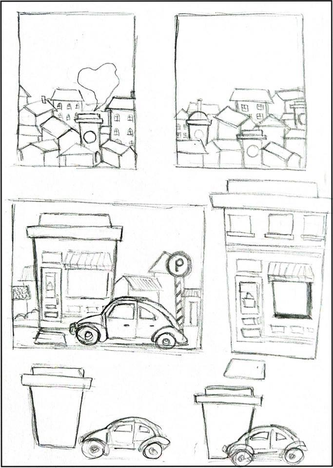 |
| Sketches. |
After showing my sketches to both of my lecturers, I realised that I misunderstood the instructions for this project. I thought we just have to come out with an artwork by applying the design principles and take the elements that we found from the billboard as an inspirations. I faced difficulties to sketch my ideas as I don't really understand the requirements and I felt lost. So, I walked around to look at my friend's work and ask for consultation from both of my lecturers. At last, I got to know that not only finding the design principles and elements in the billboard but I also need to study and understand the messages from the billboard. The final outcome of our artwork should be interpret the message that we get from the billboard and take it as the inspiration.
Then, I move on to study the two billboards chosen again and try to figure the messages as well as information from there. It took me a lot of times to think how to related both the billboards and one of my friend have actually gave me a helpful feedback. He told me that the window glass of the houses in the property advertisement is actually made from recyclable glasses and he asked me to do more researches for that.
I went to the property website through the link provided in the billboards and started to gather some informations there. I got the information that they stay true to key development principles in sustainability and they tried to maintain the goodness of the land and its natural surrounding while enhancing the existing environment by fusing nature to the towns and neighbourhoods. After that, I tried to connect this concept to another billboard which is the grab car advertisement billboards. There is a sentence on the billboard " Grab lebih, Kopi lebih " & " Tebus Sekarang" which means if you take more rides on grab you will get more coffee as reward. By coincidence, I found out that grab had cooperate with Starbucks for this event as you ride grab you will get rewards on Starbucks. I tried to figure it more about that and I realised Starbucks had actually also promoting sustainability. I gathered all the informations I have and came out with the concept of sustainability for my final project.
 |
| Analyse the billboard. |
 |
| Analyse the billboard. |
 |
| Research 1. |
 |
| Research 2. |
After deciding the concept, I started to find some references and do some sketches on it. I wanted to combine all the activities that we can do to promote sustainability in one piece so I listed it out and try to arrange it in the sketches. Later on, I transferred my idea to Adobe Illustrator and draw it digitally.
 |
| References. |
 |
| Sketches. |
 |
| Process of drawing digitally with Adobe Illustrator. |
 |
| Progress. |
 |
| Progress. |
 |
| Final Outcome. |
 |
| Final Outcome. (Printed version) |
Comments
Post a Comment