PACKAGING & MERCHANDISING DESIGN | PROJECT 1

Yeoh Xiao Shi (0331577)
Packaging & Merchandising Design
Project 1
LECTURE
Lecture 4 & 5 : Boxes Type and Boxes Style & Types of Packaging and Materials
15/04/19 (Week 3)
This week, Mr Shamsul gave us a lecture about different types and styles of boxes. From the lecture, I manage to have a better understanding on the three most common types of boxes in packaging industry : folding cartons, rigid boxes and corrugated boxes. Also, I got to learn about the two diffent styles of box which are Reverse Tuck End (RTE) and Straight Tuck End (STE).
Three common types of boxes :
01. Folding Cartons
• paperboard cartons or paperboard boxes
• can see from cereal box
02. Rigid Boxes
• sturdier compared to folding cartons
• used when the product is heavy
03. Corrugated Boxes
• refer as brown cardbaord boxes
• has three layers with fluted layer sandwiched in between
• mostly used for shipping
Two types of tuck top boxes :
01. Reverse Tuck End (RTE)
• top closure tucks from rear to front
• bottom closure tucks from front to rear (in opposite direction)
02. Straight Tuck End (STE)
• both top and bottom closure tuck from front to rear
Embedded PDF of week 3 lecture slides.
In the same class, there is also another group assigned to deliver a presentation on the types of packaging and materials. Through their presentation, I'm able to understand what is primary, secondary and tertiary packaging all about as well as various types of packaging and materials used.
Embedded PDF of week 3 lecture slides.
Lecture 6
22/04/19 (Week 4)
This week, a group was instructed to give a lecture about the colors in a packaging design which I found is interesting to me. From the lecture, I'm able to look into the importance of colors in packaging design, guides for choosing the right colors for packaging as well as the color psychology in packaging.
Colour is said to be the most important component to grab the consumers' attention. It plays a crucial role to get your shopper to see what they want to see, feel and do what the product is supposed to do. Therefore, understanding color psychology is so important for the success of our brand and packaging. However, poor color choices will lead to a negative impact.
As for the guides to choose the right colors, we should always choose a unique palette for our packaging as to be different from the competition and to stand out on the shelf. Also, the selected colors should be able to communicate with the appropriate consumers.
Color psychology is widely used in packaging design as it can be used to influence consumers' emotions and perceptions of the products. Also, color psychology act as a guide for the designer to choose the right colors for their packaging as the different color associated with different emotions and feelings.
• White : cleanliness, minimalist, safe, basic, conservative
• Black : power, authority, control, elegant
• Blue : trust, honesty, reliability
• Red : energy, action, passion, excitement
• Green : balance, harmony, natural, organic, healthy
• Orange : adventure, optimism, self-confidence, affordability, fun & adventure
• Yellow : joy, optimism, originality, creativity
• Turquoise : clarity of thought, calms the emotions, clealiness and purity
• Purple : high ideals, imagination, spirituality
• Pink : warmth, compassion, comfort, hope
• Brown : strength, solidarity, comfort, earthiness, maturity, reliability
• Gray : conservatism, neutrality, indifference, reserve
Embedded PDF of week 4 lecture slides.
Lecture 7 : Typography in Packaging Design
06/05/19 (Week 6)
This week, a group was assigned to present on the topic of typography in a packaging design which is one of the important aspects we need to consider when designing a package. Through the lecture, I managed to learn and gain some new knowledge regarding the importance and role of typography in packaging design, things to consider when selecting the typeface or font as well as how it affects the brand.
Typography is said to be important as it plays a crucial role in grabbing the consumer's attention as well as to communicate the message of a product in an interesting and creative way. Also, it can be used to define our product and create differentiation between our brand and other brands. There are a few things we need to consider when selecting the typeface or font for packaging. This including typeface or font choice, gestalt principle, readability, spacing, and size.
Typography is said to be important as it plays a crucial role in grabbing the consumer's attention as well as to communicate the message of a product in an interesting and creative way. Also, it can be used to define our product and create differentiation between our brand and other brands. There are a few things we need to consider when selecting the typeface or font for packaging. This including typeface or font choice, gestalt principle, readability, spacing, and size.
Embedded PDF of week 6 lecture slides.
Lecture 8 : Typography in Packaging Design
13/05/19 (Week 7)
This week, we were given a lecture about image and imagery in packaging design. From the lecture, I manage to understand the difference between image and imagery used in packaging design as well as their functions.
Imagery is the ability to form mental images from things or events and it is used to attract the target audience, support the product's message and also to create the perception of what the product inside is like. While for the image, there are four aspects that we need to consider when using it. This includes the relevance of images to the product and the brand, market, quality of the image and the creativity of using the image.
Embedded PDF of week 7 lecture slides.
INSTRUCTIONS
PROJECT 1
Paper Bag & Book Sleeve Design (Week 3 - Week 7)
Week 3 (15/04/19)
This week, we were given a brief on our first project in which we were required to design a paper bag, book sleeve and an item of our choice for the book that we have designed in another module (Publishing Design). The requirements for this project is that the design must reflect the book design and connected to the theme of the book cover or layout.
Before looking for the references, I tried to sketch the draft of the packaging and start thinking for the third item I want to go with. After much thinkings, I decided to choose postcards as the item of my choice. In the class, I also managed to share my ideas with Mr. Shamsul and received some feedback from him. Instead of the postcards, I was told that I could make packaging to hold it.
Week 4 - Week 5 (22/04/19 - 29/04/19)
This week, I continue to look up for some visual references so that I would have a clearer idea for the packaging structure I want to go with. Also, I started to do more sketches on the ideas.
Here are some images showing the progression below :
 |
| Fig.1.1: First draft. |
This week, I continue to look up for some visual references so that I would have a clearer idea for the packaging structure I want to go with. Also, I started to do more sketches on the ideas.
Here are some images showing the progression below :
 |
| Fig.2.1: Visual references. (paper bag) |
 |
| Fig.2.2: Visual references. (paper bag) |
 |
| Fig.2.3: Visual references. (book sleeve) |
 |
| Fig.2.4: Visual references. (postcard packaging) |
 |
| Fig.2.5: Sketches. (paper bag) |
 |
| Fig.2.6: Sketches. (book sleeve) |
 |
| Fig.2.7: Sketches. (book sleeve & postcard packaging) |
Week 6 (06/05/19)
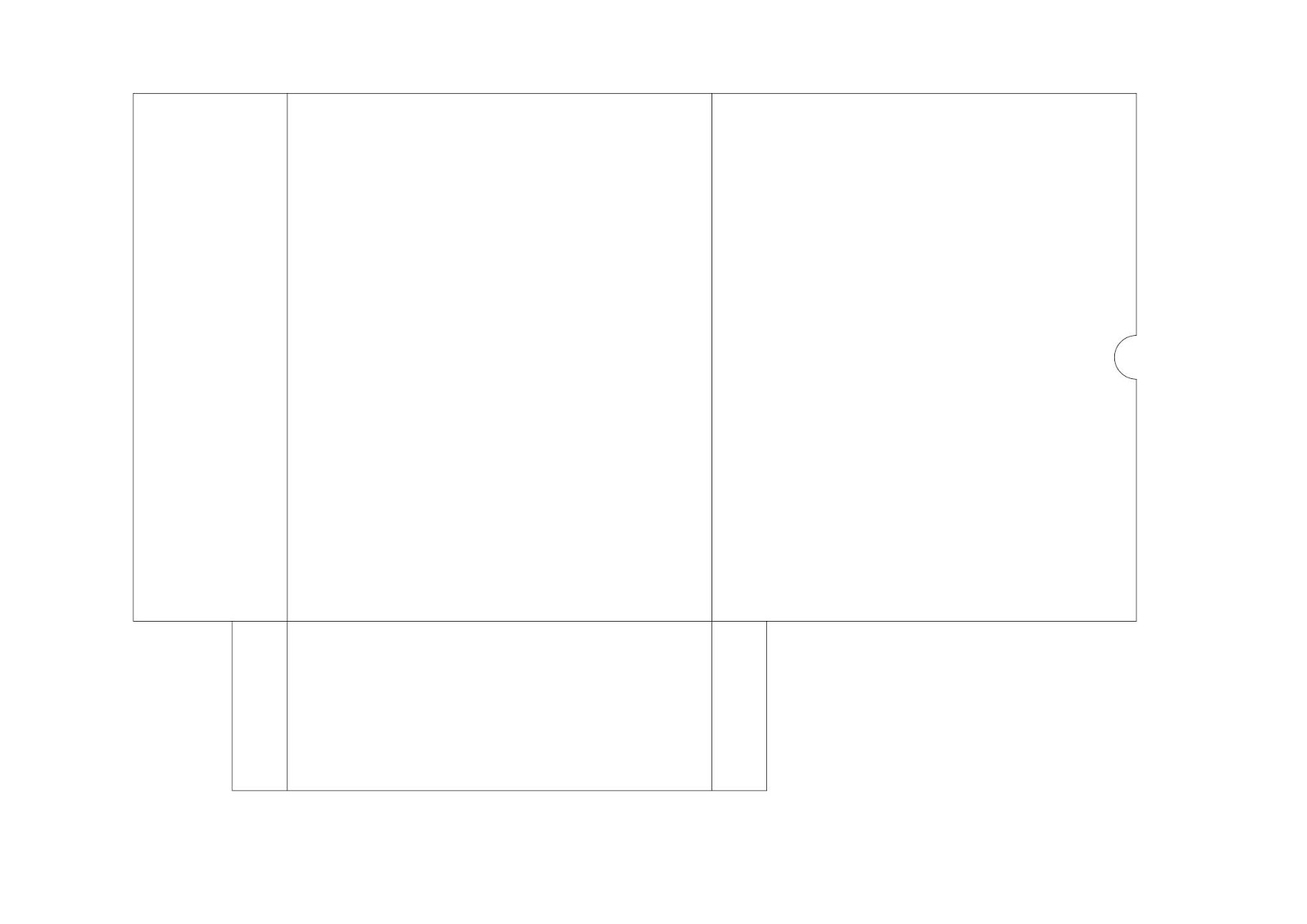
This week, I got to show my sketches of the packaging structure to Ms. Maria and she helped me to choose the best one from it. With the feedback received, I come up with the measurement for each of the packaging chosen and proceed with dieline sketches. Since the physical book has not been printed right now, I can only measure it with the mockup book I have done. As for the postcard, I decided to follow the international standard size which is 148 x 105 mm, hence the size of the packaging will be referring to this measurement. Once I completed the sketches, I also try to digitise the dieline in Adobe Illustrator as well as to create the mockup.
Here are some images showing the progression below :
 |
| Fig.3.1: Dieline sketches. |
 |
| Fig.3.2: Process of illustrating the dieline. (first attempt) |
 |
| Fig.3.3: Process of illustrating the dieline. (first attempt) |
 |
| Fig.3.4: Process of illustrating the dieline. (first attempt) |
 |
| Fig.3.5: Paper bag dieline. (first attempt) |
 |
| Fig.3.6: Book sleeve dieline. (first attempt) |
 |
| Fig.3.7: Postcard packaging dieline. (first attempt) |
 |
| Fig.3.8: Process of creating the mockups. |
 |
| Fig.3.9: Process of creating the mockups. |
 |
| Fig.3.10: Process of creating the mockups. |
 |
| Fig.3.11: Paper bag mockup. |
 |
| Fig.3.12: Book sleeve mockup. |
 |
| Fig.3.13: Postcard packaging mockup. |
Week 7 (13/05/19)
In this week class, I managed to show the mockups that I have completed to Mr. Shamsul. He mentioned it would be better if the lid of the postcard packaging can be longer, but it is okay if I want to leave it like this. Also, I received the comment that I need to make some edges of the postcard packaging rounded to make the design look ergonomic. While for the paper bag, he said that the front design doesn't look balance as the width of the handle and window is different so I would need to make it be the same later.
After receiving the feedback, I moved on to edit the dieline in Adobe Illustrator and print them out on A4 paper to check whether if the dieline works. Also, I started to design the visuals of the packaging. As to ensure the design is related back to the book, visuals that drawn in Publishing Design class are used as references.
After receiving the feedback, I moved on to edit the dieline in Adobe Illustrator and print them out on A4 paper to check whether if the dieline works. Also, I started to design the visuals of the packaging. As to ensure the design is related back to the book, visuals that drawn in Publishing Design class are used as references.
Here are some images showing the progression below :
 |
| Fig.4.1: Process of editing the dieline in Adobe Illustrator. |
 |
| Fig.4.2: Process of editing the dieline in Adobe Illustrator. |
 |
| Fig.4.3: Process of editing the dieline in Adobe Illustrator. |
 |
| Fig.4.4: Paper bag dieline. (finalised) |
 |
| Fig.4.5: Book sleeve dieline. (finalised) |
 |
| Fig.4.6: Postcard packaging dieline. (finalised) |
 |
| Fig.4.7: Paper bag mini mockup. |
 |
| Fig.4.8: Book sleeve mini mockup. |
 |
| Fig.4.9: Postcard packaging mini mockup. |
 |
| Fig.4.10: Visuals of the book for reference. |
 |
| Fig.4.11: Visuals of the book for reference. |
 |
| Fig.4.12: Visuals of the book for reference. |
 |
| Fig.4.13: Mood board. |
 |
| Fig.4.14: Colour Palette. |
 |
| Fig.4.15: Process of designing the paper bag. |
 |
| Fig.4.16: Process of desiging the book sleeve. |
 |
| Fig.4.17: Process of desiging the postcard packaging. |
 |
| Fig.4.18: Paper bag dieline with visuals. |
 |
| Fig.4.19: Book sleeve dieline with visuals. |
 |
| Fig.4.20: Postcard packaging with visuals. (front & back) |
Supposedly, this week is the submission of the project but most of us didn't manage to complete it. Hence, Mr. Shamsul gave us another option in which we need to create a 3D mockup for each of the packagings and submit it to Google Classroom by this Friday. With the instructions given, I move on to illustrate the mockup in Adobe Illustrator.
 |
| Fig.4.21: Process of illustrating paper bag mockup. |
 |
| Fig.4.22: Process of illustrating book sleeve mockup. |
 |
| Fig.4.23: Process of illustrating postrcard packaging mockup. |
 |
| Fig.4.24: Paper bag 3D mockup. (without items) |
 |
| Fig.4.25: Paper bag 3D mockup. (with items) |
 |
| Fig.4.26: Book sleeve 3D mockup. |
 |
| Fig.4.27: Book sleeve 3D mockup. |
 |
| Fig.4.28: Postcard packaging 3D mockup. |
Embedded PDF of the compilation of all 3 packaging design.
Week 8 (20/05/19)
This week, I managed to find free time and go to the printing shop for printing. Unfortunately, the timing is not right as there are lots of students wanted to print at the same time. Hence, I ended up waiting for 3 hours to get my prints done. Back home, I also proceeded to cut and assemble the packaging. As a result, only book sleeve turned out okay while for the others look rough and untidy.
Here are some images showing the progression below :
Here are some images showing the progression below :
 |
| Fig.5.1: Process of cutting & assembling. |
 |
| Fig.5.2: Process of cutting & assembling. |
 |
| Fig.5.3: Paper Bag. (first attempt) |
 |
| Fig.5.4: Bad cutting for the paper bag. |
 |
| Fig.5.5: Book sleeve & book cover. |
 |
| Fig.5.6: Postcard holder. (first attempt) |
 |
| Fig.5.7: Postcard holder. (second attempt) |
Before the end of the semester, I brought all the packaging and showed it to Mr. Shamsul. He mentioned that the book sleeve was okay, however, the paper bag and postcard holder look a bit rough because it was hand cut. Therefore, I might want to reprint and give it a try with a laser cut. With the feedback received, I moved on to reprint as well as to adjust the file for laser cutting.
 |
| Fig.5.8: Process of laser cutting. |
After a few times of failures, I finally completed all three items for this project. Although I'm not satisfied with the final outcome, I still glad that I manage to complete it. However, I think I could've done a better job for this project if there is more time.
Final submission :
Dielines
 |
| Fig.5.9: Paper bag design. (final) |
 |
| Fig.5.10: Book sleeve design. (final) |
 |
| Fig.5.11: Postcard holder design. (final) |
Actual Mockup
 |
| Fig.5.12: Paper bag. (actual mockup) |
 |
| Fig.5.13: Paper bag. (actual mockup) |
 |
| Fig.5.14: Paper bag. (actual mockup) |
 |
| Fig.5.15: Book sleeve. (actual mockup) |
 |
| Fig.5.16: Book sleeve. (actual mockup) |
 |
| Fig.5.17: Book sleeve. (actual mockup) |
 |
| Fig.5.18: Book sleeve. (actual mockup) |
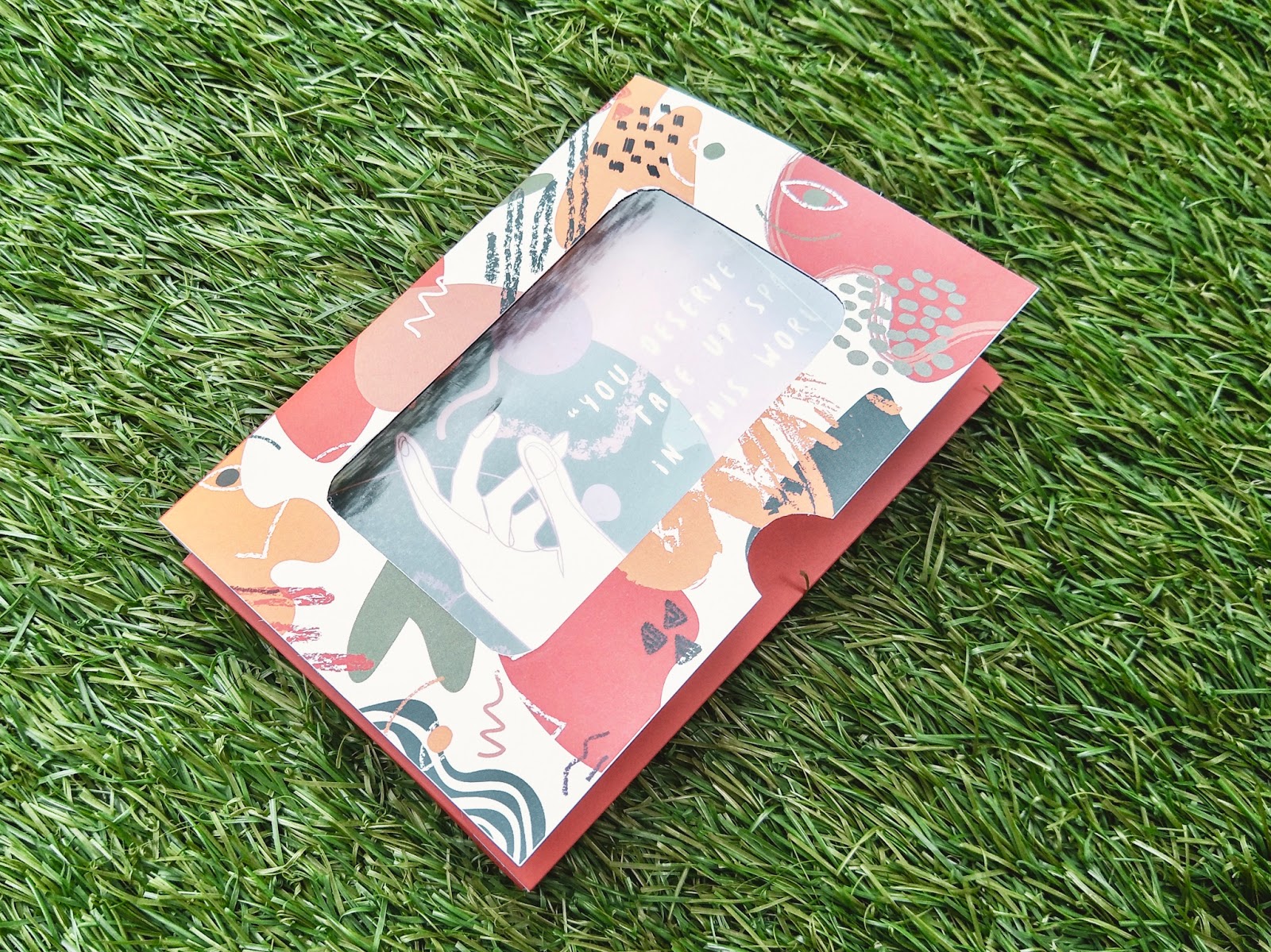
 |
| Fig.5.19: Postcard holder. (actual mockup) |
 |
| Fig.5.20: Postcard holder. (actual mockup) |
 |
| Fig.5.21: Postcard. (actual mockup) |
 |
| Fig.5.22: Postcard holder with the postcard. (actual mockup) |
 |
| Fig.5.23: All 3 packaging together. (actual mockup) |
 |
| Fig.5.24: All 3 packaging together. (actual mockup) |
Compilation in PDF file
Embedded PDF of the compilation of all 3 packaging design. (final)
FEEDBACK
Week 3
General Feedback
Specific Feedback : Mr. Shamsul looked at the first draft I drew in class and ask me to think for the third item that I want to use. Since I wanted to design a postcard for my book, he then asked me to make packaging for it.
General Feedback : No general feedback given for this project.
Specific Feedback : Not much work done this week, hence no feedback was given for this project.
Week 5
General Feedback : No general feedback given for this project.
Specific Feedback : Didn't manage to show the work, hence no feedback was given for this project.
Week 6
General Feedback : No general feedback given for this project.
Specific Feedback : Ms. Maria went through my sketches and help me to choose the best one from it. Also, she told me to start making the mock up so that I could show it in the next class.
Week 7
General Feedback : No general feedback given for this project.
Specific Feedback : Mr. Shamsul checked on the mockups that I have done and gave some comments. For the postcard packaging, he said it would be better if the lid can be longer and also make the edges rounded to be ergonomic. As for the paper bag, I need to make the width of the handle to be the same with the window so that overall it will look balanced. Other than that, I was told to make the 3D mockup of the packaging in photoshop or illustrator and submit it to the Google Classroom by this Friday since there's not enough time for me to print the dieline. While for the physical packaging, I can submit it afterward.
Week 8
General Feedback : No general feedback given for this project.
Specific Feedback : Proceed to print, cut and assemble the packaging. Therefore, no feedback was given for this project.
Week 8
General Feedback : No general feedback given for this project.
Specific Feedback : Proceed to print, cut and assemble the packaging. Therefore, no feedback was given for this project.
REFLECTION
Experiences :
Week 3 : This week, Mr.Shamsul gave us a brief regarding the first project in which we would need to come up with 3 packagings for the book we did in Publishing Design class. To start off, I try to sketch the draft of the packaging structure to explore which structure could fit my book better. Also, I started to think of the third item I want to use in this project.
Week 4 : For this week, I proceed to search up some references of the packaging structure and compiled them together.
Week 5 : With the visual references collected previously, I try to sketch out the ideas for each of the packaging this week.
Week 6 : In this week class, I'm able to show the sketches to Ms. Maria and she told me to start making the mockup before the next class. Therefore, I moved on to come up with the measurement for each of the packaging chosen and draw the dieline sketches.
Week 7 : This week will be the submission day of this project, but most of us didn't manage to print out the design. Thus, Mr. Shamsul gave us another option in which we were required to create a 3D mockup for each of the packagings and submit it to Google Classroom. Other than that, I managed to show Mr. Shamsul the mockup I have done and made some adjustments to the dieline before starting to design the packaging.
Week 8 : After submitting the design, I went for printing this week. However, there are lots of people at the time and I ended up waiting 3 hours to get my print done. At home, I also started to cut and assemble the packaging together.
Week 8 : After submitting the design, I went for printing this week. However, there are lots of people at the time and I ended up waiting 3 hours to get my print done. At home, I also started to cut and assemble the packaging together.
Observations :
Week 3 : I observed that it is a bit hard to determine the suitable packaging structure for my book now as I haven't started to illustrate the visuals in the Publishing Design class. Hence, what I can do now is just sketch out the ideas.
Week 4 : I noticed that the visual references collected did help me a lot in generating the ideas of the packaging structure.
Week 5 : I realised it is important to find some visual references before starting to sketch as I got to have an idea of how the packaging will look like.
Week 6 : I observed that the process of making the mockup is necessary as I could check whether if the measurement is correct and have a clearer idea on how the packagings would look like in the end.
Week 7 : I noticed that my progress is slower than the others now. Therefore, I need to catch up by completing all the visuals design as well as the 3D mockup for this week submission.
Week 8 : I realized creating packaging is not easy especially when I try to hand cut the paper. It took me like half day to cut and assemble them but the outcome turns out badly. Also, I noticed it requires a lot of patience as I need to cut the paper slowly so that I won't do any mistakes.Findings :
Week 3 : I found this project is interesting and fun to me as I can design the packaging freely as long as it relates back to the visuals style of my book. In addition, I found it is challenging for me to start this project this week as I'm unsure what illustration style I want for my book yet.
Week 4 : After doing some research, I found that I started to have a clearer idea of the packaging structure I want to go with.
Week 5 : I found that I got to explore different possible outcomes of the packaging by sketching, hence this process is said to be important for me to flow out the ideas.
Week 6 : I found the process of making the mockup is not as easy as I think especially when I need to make the paper bag on an A1 paper. However, it's still quite satisfying to look at the outcome of the mockups.
Week 7 : I found that time management is important for me in completing this project and other projects at the same time. It seems to be impossible but I managed to finish all three packagings design and the 3D mockup in one week. As for now, I need to print out the final design and assemble them together.
Week 8 : I found that hand-cutting is not the best choice when the material used is thick. The outcome looks rough and untidy as the cutting is not nice. Hence, I would need to use laser cut next time.
Week 8 : I found that hand-cutting is not the best choice when the material used is thick. The outcome looks rough and untidy as the cutting is not nice. Hence, I would need to use laser cut next time.
FURTHER READING (WEEK 3-8)
Week 3
 |
| Packaging Essentials: 100 Design Principles for Creaating Packages By: Roncarelli, Sarah, Ellicott, Candace |
This book is filled with examples of inspiring package design, design features, applications, and useful tips. It includes the contents about design challenge, design considerations, design process and more for the readers to understand about basic principles for creating the packages. Through this, I have read about the design considerations.
The authors include the main four things that a designer should consider when it comes to design the packaging which are materials, form and shape, labels and printing. First of all, they discussed about the materials. It is said that well-chosen package materials add to the visual experience, provide tactile interets, reduce (or increase) the costs, and increase (or decrease) environmental impact. They suggested the designers to research the options and seek for the package's potential. The next thing that should take into consideration is form and shape. A package shape is a fundamental part of brand's characteristics. It delivers messages about the product and provides a memorable foundation pn which visual and emotional values are laid. The fact that a bottle shape can be trademarked and registered is proof of its perceived value.
Other than that, a designer should also consider about the labels. Usually, the shoppers will spend five to seven seconds to scan a lable on the shelf. As to ensure that the label is read, the designer must consider the package's competetition. A different and unfamiliar label will stand out on the shelf and grabs the customers attention to pick up the product. Lastly, printing is also one of the things that need to be consider. There are different types of printing methods for packaging. Hence, the designer would need to understand and think of the methods that suitable for their design.
Week 4
 |
| Packaging & Dielines : The Designer's Book of Packaging Dielines By: Andrew Gibbs |
This e-book contains various structural designs and dielines for packaging standards that will be useful for the students and designers in exploring the packaging design. Each dieline in the book comes with a photo, brief description and basic guidelines to illustrate the structure and it become a quick reference for packaging designers. Through this, I'm able to look into different style of packagings with their dieline which got to give me some inspirations for my project 1.
Here are some paper bag design I found from this book as my reference :
 |
| Euro style shopping bag. |
 |
| Diecut handle bag. |
 |
| Diecut handle bag with flap. |
 |
| NWPP tote bag. |
 |
| What is Packaging Design? By: Gilles Calver |
This book descontructs the component parts of packaging design by discussing how each component like structure, information layout, hierarchy, photography and illustration are used in isolation and related to each other. Different visual references are also included in the book for the readers to have a better undertanding. From here, I have read about the colour used in packaging design.
According to the author, colour has many applications in packaging design. Firstly, it can be used as part of a brand's identity as to define a brand visually. When a colour has been used for a brand consistently over the time, it becomes "owned" by the brand to such an extent that when a consumer sees the colour, they could immediately associate it with the brand. Secondly, colour can be used to differentiate a product in its competitive set. It becomes an important visual discriminator for the product to stand out from others on the shelf. Thirdly, colour is also used to differentiate the products in range. When a range has two or three products or over a hundred, a colour can be applied to each type of the product to enable the consumers to make the easy distinction. However, it is said that the selection process may be compilcated by the complexity of the range hierarchy when there is much larger ranges.
Week 6
 |
| Packaging the Brand By: Gavin Ambrose & Paul Harris |
This book introduces the readers to the design and creation of packaging as it forms part of the product branding process. It aims to explore the many different ways by which brands come to be packaged and to consider the design processes that are undertaken to achieve this. From here, I have read about one of the approaches in creating branded packaging for a product to highlight its qualities, characteristics, and attributes.
It is said that creating packaging with strong appeal requires an understanding of branding, language, and color. Branding is often thought of as just a logo or catchy name that has been created for a product, but the concept of what constitutes a brand is actually much border than this. Branding is the whole process that surrounds the creation of a unique name and image for a product in the consumer's mind, which is presented through advertising campaigns and on packaging materials. The aim of branding is to establish a significant and differentiated position in the market for a product that attracts and retains customers from the target group. Meanwhile, language is used to communicate ideas with consumers. Usually, consumers will only spend mere seconds to look at a product on a shelf, hence communication has to be instant and easy to grasp. At this stage, language is perhaps the most important aspect to get right when developing a new brand as the written information on a package will project a tone of voice or attitude that must be consistent with the brand concept. Last but not least, color is an essential part of the branding and establishing the brand statement. It is important for the designers to take into account the colors used by competitors and whether the aim is to fit in or stand out. The effective use of color not only gain brand recognition but also associate and convey the messages of a product.
It is said that creating packaging with strong appeal requires an understanding of branding, language, and color. Branding is often thought of as just a logo or catchy name that has been created for a product, but the concept of what constitutes a brand is actually much border than this. Branding is the whole process that surrounds the creation of a unique name and image for a product in the consumer's mind, which is presented through advertising campaigns and on packaging materials. The aim of branding is to establish a significant and differentiated position in the market for a product that attracts and retains customers from the target group. Meanwhile, language is used to communicate ideas with consumers. Usually, consumers will only spend mere seconds to look at a product on a shelf, hence communication has to be instant and easy to grasp. At this stage, language is perhaps the most important aspect to get right when developing a new brand as the written information on a package will project a tone of voice or attitude that must be consistent with the brand concept. Last but not least, color is an essential part of the branding and establishing the brand statement. It is important for the designers to take into account the colors used by competitors and whether the aim is to fit in or stand out. The effective use of color not only gain brand recognition but also associate and convey the messages of a product.
Week 7
This article has been shared by Mr. Shamsul and we were told to read it for further reading on ideas for the project. In the article, 10 qualities the best innovative packaging designs have in common were mentioned and explained.
• Connectivity: the packaging is able to serve as a bridge between the consumers and brands
• Premium materials: exceeding the consumer's expectations
• Meeting stringent sustainability targets
• Integrating the latest generation of eco-friendly packaging materials
• Designing packaging with e-commerce in mind
• Perfectly adjusting transit packaging to dimension weighting to avoid shipping charge corrections
• Customizing the packaging with individual consumers
• Designing retail-ready packaging with optimal in-store locations in mind
• Localizing brand packaging
• Adding anti-counterfeiting features
Week 8
 |
| Article: 10 things the best innovative packaging designs have in common By: Unknown. |
This article has been shared by Mr. Shamsul and we were told to read it for further reading on ideas for the project. In the article, 10 qualities the best innovative packaging designs have in common were mentioned and explained.
• Connectivity: the packaging is able to serve as a bridge between the consumers and brands
• Premium materials: exceeding the consumer's expectations
• Meeting stringent sustainability targets
• Integrating the latest generation of eco-friendly packaging materials
• Designing packaging with e-commerce in mind
• Perfectly adjusting transit packaging to dimension weighting to avoid shipping charge corrections
• Customizing the packaging with individual consumers
• Designing retail-ready packaging with optimal in-store locations in mind
• Localizing brand packaging
• Adding anti-counterfeiting features
Week 8
 |
| Graphics and Packaging Production By: Rob Thompson |
This week, I decided to read about graphics production to have a better understanding of how the packaging being produced. This book is found to be informative as it explained the manufacturing processes that a designer needs to know and fully understand in detailed.
Engraving
All types of materials can be engraved with text and graphics including metal, plastic, wood, and stone. CNC engraving product high-quality results and are precise to 0.01mm. It can be used to engrave both 2D and 3D surfaces. The cutting speed is determined by the material and the engraving tool. It can be applied to signage, trophies, artwork, precise instruments and high-end packaging.
Photo-etching
Also referred to as acid etching and wet etching is the process of surface removal by chemical dissolution. It has a similar appearance to abrasive blasting and laser etching. The surface of the metal is masked with a resist film and unprotected areas are chemically dissolved in a uniform manner. It can be used for applications like signage, control panels, nameplates, plaques, and trophies. It is also employed by jewelers and silversmiths for decorative effect.
Abrasive blasting
The process used to apply relief graphics on the surface of hard materials such as glass and metal. Abrasive blasting is a general term used to describe the process of surface removal by fine particles of sand, plastic and other abrasive materials. It is usually applied on the metal and glass include artwork, product logos, signage, and trophies.
Water Jet Cutting
It is used to cut through almost any sheet material, including soft foam, plastic, metal, and glass. It is versatile, precise and suitable for one-off and mass production. It is reasonably energy efficient and the water is continuously recycled. It could be applied to signage, trophies and exhibition pieces.
Laser cutting
A CNC process used for applications that require a high quality and precise finish. By adjusting the laser power it is possible to cut, etch, engrave and mark a variety of materials including plastic, metal, wood, and leather. It is also known as edge glow, tinted plastics light up along the cut edge. Applications include signs and trophies, packaging, point of sale, models, and prototypes.
Vinyl cutting
A process used to create graphics for a wide range of applications, including exhibitions, shop windows, and lorry sidings. Data is transferred directly from the computer to the cutter, which is essentially an x-y plotter with a sharp blade. It is used to create the signs of the shops, museums and galleries, banners, wall stickers, exhibition graphics, and vehicle graphics.
Letterpress
A versatile relief printing process that is used to print a range of materials like packaging labels, posters, and stationery. Ink is applied to the surface of the reversed, raised type. Then, the type is pressed onto the paper to reproduce the positive image known as the right reading. The printed and embossed surface has a distinctive crafted appearance. It is best suited to print one or two flat colors. Generally, the applications that produce under this production are relatively low volume. This includes books, posters, stationery, packaging labels, flyers, and invitations.
Screen Printing
Also known as silkscreen printing. This process is used to apply graphics and coatings onto a range of materials, including paper, glass, and plastic. It is employed to print flat and cylindrical parts for diverse applications such as packaging, artwork, stationery, and exhibition graphics.
Offset Lithography
The most commercial printing technique for packaging, magazine, catalogs, newspapers, and books. It is a very rapid and low-cost method of reproducing high-quality images and text. A print is created as a result of the basic principle that oil and water do not mix.
Flexography
Also known as flexo, is a printing technique that used to reproduce images and text onto a range of materials. Continuous improvements in the presses, plate-making, and ink technology have increased demand for flexography in many applications, including packaging labels, bags, cartons and color newspapers.
Digital Printing
With this process, the digital files are outputted directly to the printer. It is inexpensive for low volumes because print plates are not required and there is little or no setup cost. The quality and speed vary according to whether it is laser or inkjet printing. Usually, this production will be used to produce books, labels, brochures, and stationery.
Comments
Post a Comment