INTERACTIVE DESIGN | FINAL PROJECT

01/11/18 - 29/11/18 | Week 10 - Week 14
Yeoh Xiao Shi (0331577)
Interactive Design
Final Project - Design, Exploration & Application
LECTURE
Lecture 10 : No Lecture (Submission of Microsite & Final Project Briefing)
01/11/18 (Week 10)
There was no lecture in this week class. Instead, we continue to work on the microsite before submitting. Before the class end, we were also given a brief on our final project so that we can prepare for it before the next class.
Lecture 11 : No Lecture (E-Learning Week)
08/11/18 (Week 11)This week will be an E-Learning week. Thus, the class will be conducted through online and we have to proceed on our final project at home. Since me and Kitty couldn't meet up, we both got to Skype and finalise all the contents for our website. With the information received, I also start to create a sitemap, wireframe sketches as well as mood boards.
Lecture 12 : No Lecture (Final Project in Progress)
15/11/18 (Week 12)
Since there was no lecture this week, we were told to work on our final project in the class. As for me, I move on to arrange all the contents and design the layout for the site in Adobe Illustrator.
Lecture 13 : No Lecture (Final Project in Progress)
22/11/18 (Week 13)
There was no any lecture being conducted this week. So, we continue to work on our final project in class as the submission is next week.
Lecture 14 : No Lecture (Submission Day of Final Project)
29/11/18 (Week 14)
Today class will be the last class for this semester, we proceed to touch up the website created before submitting. As most of us haven't complete, the due date for the final project was then extended to next Thursday.
INSTRUCTIONS
FINAL PROJECT
Design, Exploration and Application (Week 10 - Week 14)
Week 10 (01/11/18)
For our final project, we were required to develop 4-5 unique pages of a website for a classmate . This website could take the form of a web design portfolio, small business website, informational site or whatever else the client desires. The final outcome of the website must be then uploaded and hosted to a server once we complete it.
To start off this project, I have team up with Kitty. In class, we both got to discuss on the content, wireframes, colour schemes and mood boards that we would want to include in our website. At last, we decided to design a personal website for each other. To have a better understanding on her work, I also got to go through her e-portfolio and look what she have done previously.
Link to Kitty's E-portfolio :
http://kittylai9799.wixsite.com/portfolio
https://kitty99designjournal.blogspot.com
Week 11 (08/11/18)
This week is an E-learning week so we have to work on the final project remotely from home. From the previous discussion, I understand that Kitty wants her website to be a simple and minimalistic website. So, I browse through the websites that she showed me and some others minimalistic websites as my reference. As for the content, we got to finalise through Skype since we couldn't meet up. Moving on from that, I started to create a sitemap, wireframe sketches and mood boards with the contents and informations I received.
 |
| Fig.1.1: References. |
 |
| Fig.1.2: References. |
 |
| Fig.1.3: Site map. |
 |
| Fig.1.4: Wireframe sketches. |
 |
| Fig.1.5: Wireframe sketches. |
 |
| Fig.1.6: Mood boards. |
 |
| Fig.1.7: Mood boards. |
 |
| Fig.1.8: Colour palette & font chosen. |
For this week, I decided to categorise all the contents and informations received according to the site map. Later on, I start to design the layout of the website in Adobe Illustrator so that I would have a better idea of what to do for the site before coding. As for my reference, I also got to look at some bootstrap templates when designing the layout.
Embedded PDF of the contents and information collected.
 |
| Fig.2.1: Process of designing the layout in Adobe Illustrator. |
 |
| Fig.2.2: Process of designing the layout in Adobe Illustrator. |
 |
| Fig.2.3: Layout design of the homepage. |
 |
| Fig.2.4: Layout design of "ABOUT" page. |
 |
| Fig.2.5: Layout design of "PORTFOLIO" page. |
 |
| Fig.2.6: Layout design of "PORTFOLIO" page. |
 |
| Fig.2.7: Layout design of "PORTFOLIO" page. |
 |
| Fig.2.8: Layout design of "PHOTOGRAPHY" page. |
 |
| Fig.2.9: Layout design of "CONTACT" page. |
Week 13 (22/11/18)
For this week, I started to code for the website by referring to the layout drawn. Throughout the process, I got to learn about how a website formed by creating different html pages and link them together. There are also a lot of time that I feel lost as the code doesn't work, but I manage to solve it with the help of my cousin who has more experienced in coding. The images below showed some of my progress on coding in Dreamweaver.
For this week, I started to code for the website by referring to the layout drawn. Throughout the process, I got to learn about how a website formed by creating different html pages and link them together. There are also a lot of time that I feel lost as the code doesn't work, but I manage to solve it with the help of my cousin who has more experienced in coding. The images below showed some of my progress on coding in Dreamweaver.
 |
| Fig.3.1: Process of coding for the homepage. |
 |
| Fig.3.2: Process of coding for the homepage. |
 |
| Fig.3.3: Process of coding for "ABOUT" page. |
 |
| Fig.3.4: Process of coding for "PORTFOLIO" page. |
 |
| Fig.3.5: Process of coding for "PROJECT" page. |
 |
| Fig.3.6: Process of coding for "PHOTOGRAPHY" page. |
 |
| Fig.3.7: Process of coding for "CONTACT" page. |
Week 14 (29/11/18)
This week, I managed to complete 5 pages website and upload it to the webs host. Overall, the process is consider challenging and tough but I got to gain some new experiences and knowledges on coding.
This week, I managed to complete 5 pages website and upload it to the webs host. Overall, the process is consider challenging and tough but I got to gain some new experiences and knowledges on coding.
 |
| Fig.4.1: Final outcome of the "HOMEPAGE" at browser. |
 |
| Fig.4.2: Final outcome of the "HOMEPAGE" at browser. |
 |
| Fig.4.3: Final outcome of the "ABOUT" page at browser. |
 |
| Fig.4.4: Final outcome of the "PORTFOLIO" page at browser. |
 |
| Fig.4.5: Final outcome of the "PROJECT" page at browser. |
 |
| Fig.4.6: Final outcome of the "PHOTOGRAPHY" page at browser. |
 |
| Fig.4.7: Final outcome of the "CONTACT" page at browser. |
 |
| Fig.4.8: Responsive outcome. |
 |
| Fig.4.9: Responsive outcome. |
 |
| Fig.4.10: Responsive outcome. |
 |
| Fig.4.11: Responsive outcome. |
 |
| Fig.4.12: Responsive outcome. |
 |
| Fig.4.13: Responsive outcome. |
 |
| Fig.4.14: Overview of "HOMEPAGE". |
 |
| Fig.4.15: Overview of "ABOUT" page. |
 |
| Fig.4.16: Overview of "PORTFOLIO" page. |
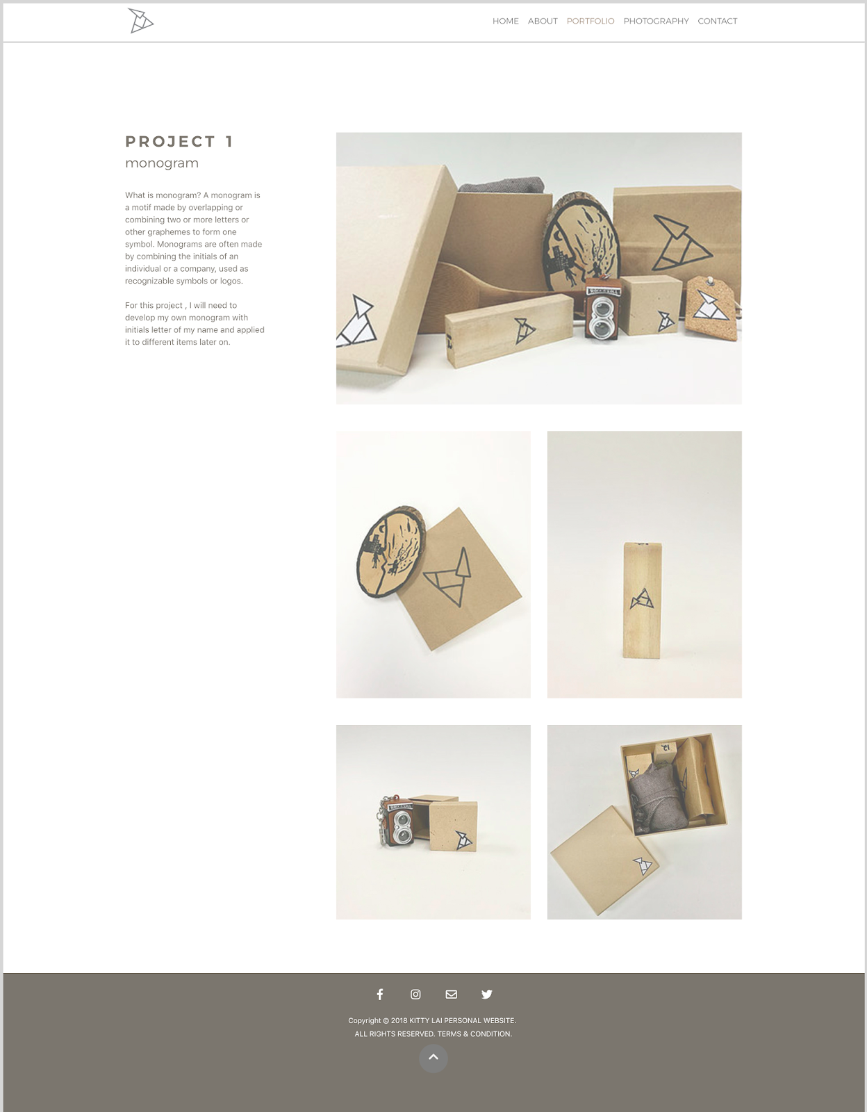 |
| Fig.4.17: Overview of "PROJECT 1" page. |
 |
| Fig.4.18: Overview of "PROJECT 2" page. |
 |
| Fig.4.19: Overview of "PROJECT 3" page. |
 |
| Fig.4.20: Overview of "MINIMALISM" page. |
 |
| Fig.4.21: Overview of "MONOCHROME" page. |
 |
| Fig.4.22: Overview of "LIFESTYLE" page. |
 |
| Fig.4.23: Overview of "TRAVELLING" page. |
 |
| Fig.4.24: Overview of "CONTACT" page. |
Embedded PDF of the website created. (final outcome)
Link to the website : http://xiiaoshi19.000webhostapp.com/kittylai/index.html
FEEDBACK
Week 10
General Feedback : Briefing for final project was given and we were told to discuss with our partner to know what they want for their website as well as to figure out the contents to be included in. Other than that, we were told to ready for the content, site map as well as mood board before the next class.
Specific Feedback : After looking at my microsite, Mr Shamsul and Mr Lun commented that overall was good but I could add in some images like poster if I want to. Other than that, I was told to upload the microsite to web hosting once I complete it.
Week 11
General Feedback : No general feedback given since we did not have class this week.
Specific Feedback : No specific feedback given since we did not have class this week.
Week 12
General Feedback : No general feedback given, continue to work on the final project.
Specific Feedback : No specific feedback given, continue to work on the final project.
Week 13
General Feedback : No general feedback given, continue to work on the final project.
Specific Feedback : For the project 2, I was told to add more words in "about" section so that it won't looks so empty. While for the "featured products" section, the words on the image is not legible so I have to make some changes for that.
Week 14
General Feedback : We were told to submit the link of our website along with the compressed zip file as for the submission of final project in Google classroom. Other than that, we should change at least 90% of the design if we use template for the website.
Specific Feedback : No specific feedback given.
REFLECTION
Experiences :
Week 10 : In this week class, we were given a brief on our final project which we need to create a website for a friend. After briefing, I got to team up with Kitty and go through her e-portfolio to look what she have done previously. Hence, I would have a clearer idea of what to include for her contents.
Week 11 : This week is an e-learning so I have to finalise all the content with my friend through online. I also got to look at difference minimalistic website as my reference to do some wireframe sketches.
Week 12 : For this week, I decided to categorise and arrange all the contents and informations I got to make it looks organised. Moving on from that, I start to design the layout in Adobe Illustrator so that I can have a better idea of the overall look for the website.
Week 13 : This week, I got to start on creating the website. With the layout drawn, I proceed to code in Adobe Dreamweaver.
Week 14 : It came to the end of this semester and I manage to gain more knowledges on web design as well as coding by completing all the projects for this module.
Observations :
Week 10 : In class, I manage to discuss the content, wireframes, colour schemes as well as mood boards with my friend so that we know what to include in each other website. From the discussion, I got to know she prefers her website to be simple and minimalistic.
Week 11 : I observed that the process of finding references, creating site map, wireframe sketches and mood boards are really useful for me to identify which style of design achieve the requirements of my friend.
Week 12 : I realised I got to save a lot of time to design the layout with the organised contents and informations as I can find the info that I want easily.
Week 13 : I observed that it is important create a new class for each of the element when there are different styles so that it won't mess up. Other than that, I realised I have to always check on the responsive outcome for different screen size at preview instead of the static website.
Week 14 : I noticed I manage to learn the basic coding in this semester but there's still room for improvement.
Findings :
Week 10 : Creating a website isn't an easy work for me as I still not good with coding. Thus, I would need to plan my time well and organise all the information nicely to make the process easier.
Week 11 : I found that most of the minimalist websites use limited or monochromatic colour palette and the designer has maximised the use of negative space to direct the user's attention and allow them to read through the content more easily.
Week 12 : I found that I got to design the website easier with the wireframe sketches and mood boards created as there is a visual reference for me.
Week 13 : Learning through mistakes and keep on trying are the two important things that I could learned from this project. Throughout the process, there are a lot of times I felt lost and don't know what to do. Thus, I got to keep trying and also seeking help from others.
Week 14 : Throughout this 14 weeks, I found that I got to understand how the web being created with html and css file better. Also, gaining more knowledges on the aspects that I would need to consider while designing for web.
FURTHER READING (WEEK 10 - WEEK 13)
Week 10
 |
| Web Design 101, Chapter 9 : How to design landing pages that convert. By : Neal O' Grady |
Week 11
 |
| Web Design 101, Chapter 4 : How element spacing works. By : David Khourshid |
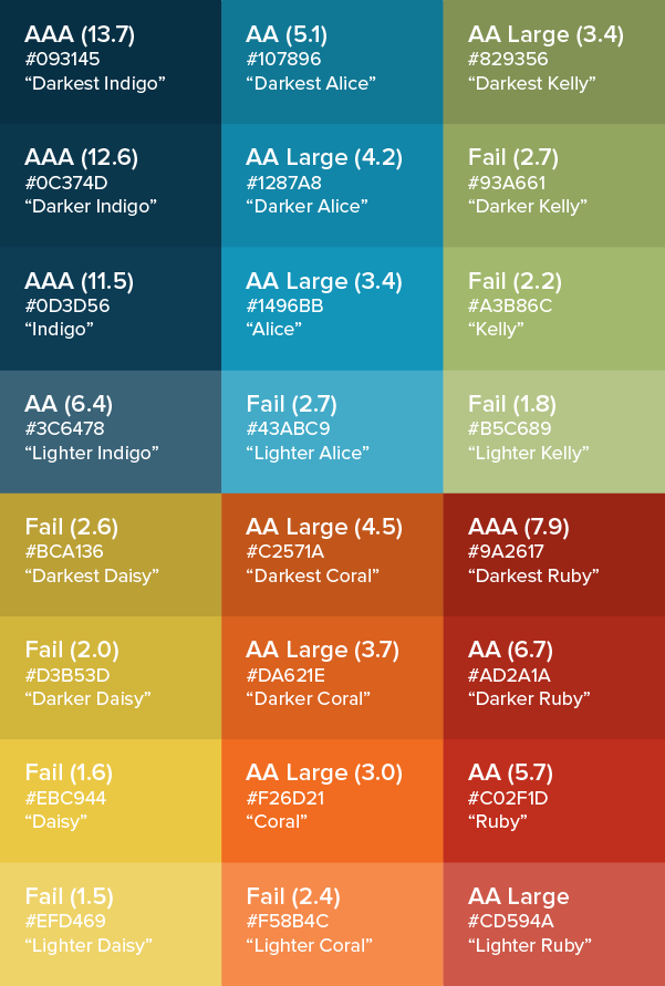
To understand more on the box model, I have read about "how element spacing works" from this book. According to the author, the box model is what determines the structure, layout and dimensions of all the elements on a page. It is said that every element on a web page is a rectangular box and each one of these rectangular boxes has a height and a width.
 |
| Fig.1.9: Box model. |
Even box will have four areas that layer atop one and another. For the content area, it is the area naturally consumed by the content that constitutes an element like the words in a sentence, an image, or the child elements contained within a parent element. Next, padding will surrounds the content area to force a distance between the content area and the invisible boundary of the box that dictates the element's shape. Then, it comes to border area which is the size of the outline or boarder that surrounds the box. It can take its own space that adds onto the core content's area. Lastly, the transparent white space outside the box that distances the box from its neighbouring elements is known as the margin area. It can be used to determine the space between an element and its surroundings.
Week 12
 |
| Web Design 101, Chapter 10 : Why your design process should start with content. By : John Moore Williams |
Taking a content first approach offers several benefits that range from enabling a better overall design vision to catch problems in the design before they become problems. Firstly, it allows us to build out a sensible information architecture. It will be easier for us to define the overall sitemap and build out a logical hierarchy when we know what content we want to include in the site. Besides that, we can design to optimise the content. For example, if we know that client's bloggers use quotes a lot, we can design a section to showcase block quotes and callouts. Other than that, content first deign help us to create consistency across the site. When we have the content, we are able to create a more consistent interface and keep us from having to create a bunch of messy combo classes which not related to the site. Lastly, it also help us to avoid endless round of iteration. We would not need to have a lot of changes during the development process of the website since we have clearer idea when designing with content first.
There are some fields in terms of the visual design that we would need to remember when starting with content first design : plain text, rich text, image, video, link, number, date/time, switch, colour, reference and multi-item reference. Moreover, we could also creating a content model to map out content types, their relationships and requirements as well as to develop the site's overall information architecture. It is like creating a sitemap , but it focuses on content types and their characteristics instead of pages.
Week 13
This week, I read about HTML/ CSS frameworks from this book. According to the book, framework in the web development sense can be likened to a library that not of books but of design patterns, complete with all needed functionality. For example, the Pure framework knows, with overlap, the button types like default, primary, icon, active, disabled and customised. Frameworks are used as it promise to save both development and design time. The thinking goes that many of the things site owners and developers want have been done a thousand times, and thus there is no need to reinvent the wheel. Internal frameworks commonly enjoy a more sober regard, so this particularly applies to the external frameworks. However, there is a difference between internal and external frameworks as the external ones are those that typically get referred to as framework. A good framework is not only tailored but also usable. It start with applying the common definition of usability : ease of use and learnability as well as with a universal rule : keep it simple. In order to make a frameworks more usable for users, we have to keep it simple, follow usability conventions, perform usability tests and provide documentation for framework users. As for to make frameworks that more usable for developers, we also have to keep it simple, aim for self-explanatory code, format code legibly and consistently, follow maintainability best practices as well as to provide documentation for framework developers.
There are some fields in terms of the visual design that we would need to remember when starting with content first design : plain text, rich text, image, video, link, number, date/time, switch, colour, reference and multi-item reference. Moreover, we could also creating a content model to map out content types, their relationships and requirements as well as to develop the site's overall information architecture. It is like creating a sitemap , but it focuses on content types and their characteristics instead of pages.
Week 13
 |
| The Little Book of HTML / CSS Frameworks By : Jens Oliver Meiert |
Week 14
 |
| Color Contrast for Better Readability By : Tom Osborne |
 |
| Fig.3.1: Establishing tints, tones and shades. |
 |
| Fig.3.2: Colorable [Demo] by Brent Jackson. |
 |
| Fig.3.3: Testing a neutral colour palette as text on white background. |
 |
| Fig.3.4: Combination of white with various colours. |
 |
| Fig.3.5: Example with darks on a lighter background. |
 |
| Fig.3.6: Example with lights on a darker background. |
Comments
Post a Comment