INTERACTIVE DESIGN | PROJECT 1
20/09/18 | Week 4
Yeoh Xiao Shi (0331577)Interactive Design
Project 1 - Landing Page Design
LECTURE
Lecture 4 : Type for Screen
20/09/18 (Week 4)
In this week class, we were given a lecture on type for screen. With the popular web font services like Adobe Typekit, Google Font, and Hoefler & Co.'s Cloud nowadays, we can presenting beautiful type on our website. Unlike the old days, there were limited choice of typefaces such as Arial, Verdana, Helvetica, Georgia and Times New Roman. However, thousands of typefaces in the modern days make the designers life difficult as they need to choose and combine the typefaces.
Besides that, we were also taught on web safe fonts, the fonts that are pre-installed by most of the operating system. There are total 15 total web safe fonts which are Arial, Helvetica, Times New Roman, Times, Courier New, Courier, Verdana, Georgia, Palatino, Garamond, Bookman, Comic Sans Ms, Trebuchet Ms, Arial Black and Impact. All this fonts are widely accessible and have been installed by most of the devices.
Embedded PDF of week 4 lecture slides.
INSTRUCTIONS
PROJECT 1
Landing Page Design (Week 4)
Week 4 (20/09/18)
In the previous class, Mr Shamsul gave us a brief on our first project which we will need to design a static landing page of our favourite singer, band, sports team or movie. We were told to look for some design samples as inspiration and come out with at least 5 sketches. Moreover, we will also need to do some researches and readings on mobile friendly websites to understand how the website works in mobile screen. For this project, we can use colours in our design as well as the typefaces from Google Fonts. However, we were advised to choose the typeface wisely and also consider the size of it so that the user can read easily.
Before sketching for the layout and wireframe of the website, I have chosen my favourite Kpop group which is Highlight. As my references, I browse on their official website and some others entertainment company website. Looking through all the websites, I get to know that most of the artist websites included profile, notice, schedule, gallery, album and video as the main purpose is to provide latest information and news for the fans and others that would like to know more about them.
 |
| Fig.1.1: Reference 1. |
 |
| Fig.1.2: Reference 2. |
 |
| Fig.1.3: Reference 3. |
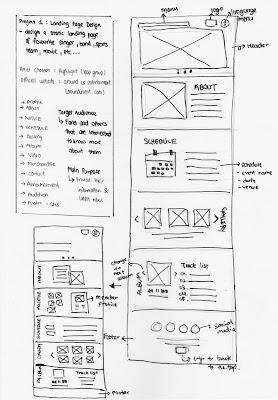
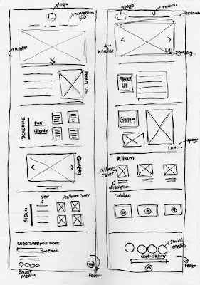
Once I done browsing on different websites and get some inspirations, I listed out the contents that can be included as well as sketching the wireframe of the website in A4 paper.
 |
| Fig.1.4: Sketches 1. |
 |
| Fig.1.5: Sketches 2. |
 |
| Fig.1.6: Sketches 3. |
 |
| Fig.1.7: Process of designing on Illustrator. |
 |
| Fig.1.8: Process of designing at Illustrator. |
 |
| Fig.1.9: Process of designing at Illustrator. |
 |
| Fig.1.10: Process of designing at Illustrator. |
 |
| Fig.1.11: Process of designing at Illustrator. |
 |
| Fig.1.12: Process of designing at Illustrator. |
 |
| Fig.1.13: Process of designing at Illustrator. |
We were told to complete our landing page by the end of this week and submit it on Google Classroom. So, here is the final outcome of my landing page design below.
Fig.1.14 & 1.15: Final Outcome of landing page design.
FEEDBACK
Week 4
General Feedback : Mr Shamsul said that a standard layout for the website should always include header, contents and footer, that is the reason why most of the websites look almost the same. Besides that, the contents need to fix in either 1000 pixels or above when deciding the width of the website while the length of the website is based on the content that we want to include. We were also told that the size must be in pixels and the colour should be in RGB when designing a website. Lastly, we were advised to use grid so that we will have a good alignment.
Specific Feedback : Overall, the idea for the layout is good but the title of the content should be always placed on the left and in one direction. This is because the readers always read from the left to the right. It is also good that I browse on some websites and compare them as it will help in my design process.
REFLECTION
Experiences :
Week 4 : Before designing digitally, Mr Shamsul went through all of our sketches and give some feedbacks. Later on, we start designing the landing page based on the sketches on Adobe Illustrator or Photoshop. It was indeed an interesting project for me as I could design a website for my favourite artist and I really enjoy the process of designing.
Observations :
Week 4 : I observed that we should not only think for the design while designing a landing page but also think for the purpose of the website as well as the target audience in order to promote the artist more efficiently. Besides that, I get to noticed the use of the guidelines and grid for the proper alignment.
Findings :
Week 4 : I found out there are a lot of things that I would need to consider while designing the landing page like the colours, fonts, fonts size, alignment and others as all of this will influence the readability of the audience. I also noticed that it is important for us to browse on different websites and look through how they design the website in order to understand which design style works better in website.
FURTHER READING
Week 4
| Pixel Perfect Precision (E-Book) By: Gyppsy Link : https://www.ustwo.com/blog/the-ustwo-pixel-perfect-precision-handbook-3/ |
Clarity : keep design clear and concise to avoid too much of content for the user to look through.
Consistency : maintain consistency across a number of levels, including style, navigation, typography, and use of language. Interface elements should act in a standard way whenever they appear, and where possible follow any conventions or patterns from the host operating system which means that the users can predict how it works based on the past experiences with the platform.
Navigation : It is important to have consistency in navigation as it will help the users move around the app without felling lost. The designer should also consider the need of the users when creating the layout for a page so that the content structure works in the way that users can find what they want easily. In addition, limited scrolling to one direction and minimise the step for the users to click as too much of it may cause frustration.
Interaction : When creating designs for touch-based devices, the designer should always consider how easy they are to operate using fingers and thumbs. The minimum touch area is 7mm x 7mm and the gap between the the items should be in 2mm so that the users don't get pressed accidentally. For the web, it is more recommend to use buttons than hyperlink as it will confuse the users. And also don't underline the text when that isn't a link. This is because the user may think something is wrong when they tap it and nothing happens.
Error Prevention : It is better to minimise errors that can occur while using your product. There are various of techniques available. For example, placing useful elements at the fore and isolating or hiding those that can be risky; using warnings and confirmation as methods to prevent errors; and providing fall-safes should anything go wrong as well as make the users think about what they are doing in important situations rather than allowing to cruise through on autopilot.
Feedback : Provide some feedbacks to the users when they are performing tasks so that they feel reassured. If they are no any feedbacks, the users might wonder is the app frozen or pause. So, it is important to have feedbacks either in the form of spinners or messages to notify the users of what is happening.
Typography : The minimum font size that should be use is 12pt and with a good reading size around 16 pt. If you make the text too small, the users might not see clearly especially on lower density screens which are not that sharp. The line lengths is suggest to keep below 80 characters wide and also leave enough space between the lines of the text to help the flow of reading. The recommend line spacing is 1.5 times that the type size. Moving and blinking text are not recommend to use as visually impaired and dyslexic users can find this very distracting.
Testing : Test the application's accessibility features like black and white zoomed view, and text to speech on real devices rather than simulators so that you can experience how the designs work.


Comments
Post a Comment