ADVANCED TYPOGRAPHY | EXERCISES

Yeoh Xiao Shi (0331577)
Advanced Typography
Exercises
LECTURE
Lecture 1 : Introduction to the module & Typographic Systems
27/08/18 (Week 1)
To start off the class, Mr Vinod gave us a brief on this module and explain the breakdown of our future assignments in detail. Then, he gave us a quick recap on the format for our e-portfolio so that we won't repeat the same mistakes that we did in previous semester. Moving on from that, we were taught on the 8 typographic systems which is related to our first exercise. Unlike previous semester, we will need to do our own researches and gave the lecture by ourself in this semester. Mr Vinod said that learning through research is better for us to understand the topic than just absorbing the lecture that he gave in the class. So, we were divided into 8 groups and each of the group will be given a system to be presented.
8 Typographic Systems :
Axial - design to the left and right of a single axis
Radial - design from a central point of focus
Dilatational - design along a circular path
Random - spontaneous design
Grid - design with vertical and horizontal divisions
Modular - designed with standardized units
Transitional - design with shifted bands and layers
Bilateral - design that is symmetrical to an axis
Here is the compilation of the slides for this week lecture below.
Embedded PDF of the compilation of 8 typographic systems.
Lecture 2 : No Lecture (Typographic Systems Exercise)
03/09/18 (Week 2)
We don't have any lecture today. Both of our lecturers began the class by checking our exercise for the 8 typographic systems. They went through all of our works and commented on it. Mr. Vinod have pointed out three important aspects that we should always bare in mind when designing a layout which is abiding the typographic system given, make sure the output is well laid out and the element of communication must be visible, hierarchy as well as readability. Once he said that if we found uncomfortable with the design thats mean there are some problem with the layout which means not balance yet. He also said to have a good design of layout and composition, we will need to consider all the design principles and have a good space division. During this section, I found out I'm able to learn more as I got to hear some feedbacks for others instead of mine.
Lecture 3 : No Lecture (Public Holiday)
10/09/18 (Week 3)
There was no class this week due to public holiday. However, tasks were already given in the previous class. The exercise were divided into two parts and we were required to work on the first part at home this week. Mr Vinod also posted a message on facebook as reminder for us to continue with our work. We were also told to send him our works if we need some feedbacks.
Here is the message from Mr Vinod below.

Lecture 4 : No Lecture (Public Holiday)
17/09/18 (Week 4)
There was no any lecture since we don't have class this week but we still need to complete our exercises given at home.
24/09/18 (Week 5)
In this week class, three of the groups were presented on the history of typefaces as well as the what inspired the typeface designers to create the font. After the presentation, both of our lecturers started to check on our previous exercises and give some comment. With the feedbacks given, we will need to make some changes to improve the design.
INSTRUCTIONS
EXERCISES
Typographic Systems (Week 1- Week 2)
Week 1 (27/08/18)
In the first class, we were given an exercise which we will need to understand the 8 typographic systems that we presented in the class and use the info from it to make one presentation of our own. There are 8 systems in total and we were told to make 2 layouts for each system. Instructions were given and we were required to explore the contents provided in module outline on a page with the size of 200 x 200 mm. We were allowed to add some graphical elements like line, dot and so on but limitedly. In addition to black, we can also use one other colour to complete this exercise.
 |
| Fig1.1: Process of designing for typographic systems. (1st attempt) |
 |
| Fig1.2: Process of designing for typographic systems. (1st attempt) |
 |
| Fig1.3: Process of designing for typographic systems. (1st attempt) |
 |
| Fig1.4: Process of designing for typographic systems. (1st attempt) |
 |
| Fig.1.5: Axial system. (1st attempt)] |
 |
| Fig.1.6: Axial system. (1st attempt) |
 |
| Fig.1.7: Radial system. (1st attempt) |
 |
| Fig.1.8: Radial system. (1st attempt) |
 |
| Fig.1.9: Dilatational system. (1st attempt) |
 |
| Fig.1.10: Dilatational system. (1st attempt) |
 |
| Fig.1.11: Random system. (1st attempt) |
 |
| Fig.1.12: Random system. (1st attempt) |
 |
| Fig.1.13: Grid system. (1st attempt) |
 |
| Fig.1.14: Grid system. (1st attempt) |
 |
| Fig.1.15: Modular system. (1st attempt) |
 |
| Fig.1.16: Modular system. (1st attempt) |
 |
| Fig.1.17: Transitional system. (1st attempt) |
 |
| Fig.1.18: Transitional system. (1st attempt) |
 |
| Fig.1.19: Bilateral system. (1st attempt) |
 |
| Fig.1.20: Bilateral system. (1st attempt) |
 |
| Fig.1.21: Thumbnails. (1st attempt) |
 |
| Fig.1.22: Thumbnails. (1st attempt) |
Embedded PDF of Typographic systems exercises. (1st attempt)
Week 2 (03/09/18)
This week, both of our lecturers went through all of our artworks and give some feedbacks on it so that we can improve our design better. With the feedbacks given, we will need to make some changes on our design and upload it here again. For me, there are not much problems with my artwork but Mr Vinod stated that my design for modular system was incorrect and bilateral system seems like can be done more better. So, here are the final outcome for my artwork below.
Type & Play Exercise (Week 3 - Week 5)
Type & Play - Part 1 : Finding Type
Week 3 (10/09/18)
This week exercise was divided into two parts and we were expected to complete the first part at home since it was a public holiday. In the first part, we will need to make a selection of an image between man-made objects, structures and nature. With the image chosen, we were told to dissect it and identify at least 5 potential letterforms from it at Adobe Illustrator. Later on, we were required to to refine the letterform. The requirements for the size of this exercise is 200x200mm and the image used should be in monochrome.
 |
| Fig.2.1: Process of editing after feedback given. |
 |
| Fig.2.2: Process of editing after feedback given. |
 |
| Fig.2.3: Process of editing after feedback given. |
 |
| Fig.2.4: Axial system. (final outcome) |
 |
| Fig.2.5: Axial system. (final outcome) |
 |
| Fig.2.6: Radial system. (final outcome) |
 |
| Fig.2.7: Radial system. (final outcome) |
 |
| Fig.2.8: Dilatational system. (final outcome) |
 |
| Fig.2.9: Dilatational system. (final outcome) |
 |
| Fig.2.10: Random system. (final outcome) |
 |
| Fig.2.11: Random system. (final outcome) |
 |
| Fig.2.12: Grid system. (final outcome) |
 |
| Fig.2.13: Grid system. (final outcome) |
 |
| Fig.2.14: Modular system. (final outcome) |
 |
| Fig.2.15: Modular system. (final outcome) |
 |
| Fig.2.16: Transitional system. (final outcome) |
 |
| Fig.2.17: Transitional system. (final outcome) |
 |
| Fig.2.18: Bilateral system. (final outcome) |
 |
| Fig.2.19: Bilateral system. (final outcome) |
 |
| Fig.2.20: Thumbnails. (final outcome) |
 |
| Fig.2.21: Thumbnails. (final outcome) |
Embedded PDF of Typographic systems exercises. (final outcome)
Type & Play Exercise (Week 3 - Week 5)
Type & Play - Part 1 : Finding Type
Week 3 (10/09/18)
This week exercise was divided into two parts and we were expected to complete the first part at home since it was a public holiday. In the first part, we will need to make a selection of an image between man-made objects, structures and nature. With the image chosen, we were told to dissect it and identify at least 5 potential letterforms from it at Adobe Illustrator. Later on, we were required to to refine the letterform. The requirements for the size of this exercise is 200x200mm and the image used should be in monochrome.
 |
| Fig.3.1: Original image. |
 |
| Fig.3.2: 200x200mm size of image. |
 |
| Fig.3.3: Process of dissecting and identify the letterforms. |
 |
| Fig.3.4: Letterform identified from image. |
 |
| Fig.3.5: Letterform identified from image. |
 |
| Fig.3.6: Letterform identified in white background. |
 |
| Fig.3.7: Arranging letterform in white background. |
As there was no class this week, we were told to send our artworks through facebook if we need some feedbacks. Mr Vinod commented that the results of my work is quite interesting. However, I should actually dissect my image by drawing lines on the various curves or straight lines and selecting or making shapes on the letterform that I look at first. Besides that, I was told to continue my work by refining the letters that I obtained from the image as they are still crude. Mr Vinod also suggested to place the letters on a baseline to view its x-height, ascender, descender and cap height to check on proportion, consistency and character.
With the feedbacks given, I continue my work by placing it on the baseline and mean line. Later on, I started to refine it by adjusting the width and the proportion of the letterforms as we only need to retain some element of the original form.
 |
| Fig.3.8: Process of placing the letterforms on the guideline. (first attempt) |
 |
| Fig.3.9: Process of refining the letterforms. (first attempt) |
 |
| Fig.3.10: Letterforms placed on the guideline. (first attempt) |
 |
| Fig.3.11: Refinement of letterforms. (first attempt) |
 |
| Fig.3.12: Final outcome of the letterforms after refining. (first attempt) |
Week 5 (24/09/18)
This week, Mr Shamsul and Mr Vinod went through all of our exercises and comment on it. For the first part of exercise 2, I was told that I should continue to refine my letters by maintaining its originality and also be aware of the consistency of the strokes. The angle for each stroke should be same and in the same direction. Furthermore, Mr Shamsul told me to put all the letters in one line and see the letter's characteristic as well as to check its consistency.
 |
| Fig.5.1: Process of refining the letterforms. (second attempt) |
 |
| Fig.5.2: Check the consistency in one baseline. (second attempt) |
 |
| Fig.5.3: Refinement of letterforms. (second attempt) |
 |
| Fig.5.4: Final outcome letterforms after refining. |
 |
| Fig.5.5 Final outcome of letterforms after refining. |
Embedded PDF of Type & Play Part 1. (final outcome)
Type & Play Part 2 (Week 4 - Week 5)
Week 4 (17/09/18)
This week, we don't have class as well due to public holiday. So, we will need to continue the part 2 of our exercise at home. For the second part of this exercise, we were told to use our own image of a man-made structure or object, and nature and combine with 20-30 words. In this exercise, we were only allow to use single colour and any typefaces of the 10 type families provided. In addition. the requirement for the size of the dartboard is in A4. To select the image, I went through my gallery and choose the photograph that I can work on it. At last, I decided to go with the image of a light bulb that I took in a cafe previously.
 |
| Fig.4.1: Original image. |
 |
| Fig.4.2: Process of removing the light bulb. |
 |
| Fig.4.3: Change the image to black & white. |
 |
| Fig.4.4: Process of combining the sentence with the image. |
 |
| Fig.4.5: Final Outcome. (first attempt) |
Week 5 (24/09/18)
With the feedback given, I was told that my design for part 2 is too safe as I just fill the text in a light bulb. So, I would need to rework on it again. I was also told to think imaginatively by playing around the words and the composition of it.
 |
| Fig.5.6: Original image.(From Pexels) |
 |
| Fig.5.7: Black & White image. |
 |
| Fig.5.8: Process of combining the sentence with the image. |
 |
| Fig.5.9: Final Outcome. (second attempt) |
 |
| Fig.5.10: Original Image. (From Pexels) |
 |
| Fig.5.11: Black & White image. |
 |
| Fig.5.12: Process of combining the sentence with the image. |
 |
| Fig.5.13: Process of combining the sentence with the image. |
 |
| Fig.5.14: Final outcome. (third attempt) |
 |
| Fig.5.15: Original Image. (From Google) |
 |
| Fig.5.16: Black & White image. |
 |
| Fig.5.17: Process of combining the sentence with the image. |
 |
| Fig.5.14: Final outcome. (final attempt) |
Embedded PDF of Type & Play Part 2. (final outcome)
FEEDBACK
Week 1 :
General Feedback : No general feedback given since this week is just the first class.
Specific Feedback : No specific feedback given since this week is just the first class.
Week 2 :
General Feedback : Mr Vinod went through all of our works and indicate three things that we should always remember when coming to create the layout like this exercise. Firstly, the layout or composition must abide by the system. Secondly, ensuring the output is well laid out and looks good. Thirdly, ensure that the design can communicate with the viewer clearly by being aware of the hierarchy of information. We were not recommended to use black as the background colour and grey was suggested to replace it. Moreover, we were also told to consider other design principles and space divisions in order to have a good layout and composition in our artwork. Specific Feedback : Overall, there are not much problems with my artwork. I was told that my design for modular system was incorrect (needed to redo again) and for bilateral system looks like just justifying the text (can be done more better).
Week 3 :
General Feedback : We didn't receive any general feedback since we don't have class this week. Specific Feedback : Interesting results. You should dissect your image but drawing lines on the various curves or straight lines you see prior to selecting or making shapes. The letters you obtained from the image presently crude. Several iterations are needed still for the purpose of refinement. Please place your letters on a baseline to view its x-height, ascender, descender and cap height to check on proportion, consistency and character. Continue to refine it while retaining some element of the original form. I think the image chosen has limited your output to a degree. But its's still interesting. (Feedback from Mr Vinod via Facebook)
Week 4 :
General Feedback : No general feedback given since we did not have class.
Specific Feedback : No specific feedback given since we did not have class.
Week 5 :
General Feedback : For the group's presentation, Mr Vinod said that we should not cooperate just to get our things done but also to collaborate as a team and help each other when the members need help. Besides that, we will also need to interact with the audiences by asking them questions to ensure they understand what we talked about as well as to grab their attention. For exercise 2, most of our work did not up to Mr Vinod's expectation so that we we required to rework again. Specific Feedback : During the presentation, I was given a feedback that I should provide the image below what I explained instead of putting it in another slide so that the audience can understand easily. After looking at my e-portfolio, Mr Shamsul commented that overall the typographic system exercise is good but one of the design for random system can be explored more. While for my exercise two, part one need to make some changes by maintaining its originality and be aware of consistency. For part 2, I was told that my design is too safe, need more imagination for it.
REFLECTION
Week 1 : During the class, we were divided into groups to do research and understand the typographic system given. Later on, we will need to present and explain what we understand to our classmates. The presenters will also need to answer the questions by each of the other groups.
Week 2 : In this week class, I got to hear some useful feedbacks from both of the lecturers as well as gaining some new knowledges on typographic system. I also got to see how my classmates applied the 8 typographic systems in their design as well.
Week 3 : We have to complete this week exercise remotely from home since it was a public holiday. I found out this exercise is quite interesting and fins as we need to find and identify letterforms from the surroundings.
Week 4 : This week, we need to continue working on the second part of the exercise at home as well due to another public holiday. For the second part, we were required to combine an image with a sentence of 20-30 words. I took me some times to complete since I don't have any idea for it.
Week 5 : For this week, I have to rework on my exercise 2 with the feedback given as I did not manage to achieve the requirements.
Observations :
Week 2 : I realised most of the mistakes we did in this exercise are similar. Mr Vinod has pointed out and explained it more in details. Relevant examples are also shown so that we can understand it better.
Week 3 : I observed that we could actually find different letterforms from our surroundings and the results were quite interesting. Besides that, I also got to notice the details of the structure from my surroundings through this exercise.
Week 4 : I found that it is not easy when combining the text with the image as I need to be aware of the overall composition as well as the placement of the text.
Week 5 : I observed that the results of the letters that refined for second time looks smoother then the previous one. With the same angle of stroke used, the letters also look more consistency. For the part 2 of the exercise, I still found out it is challenging for me as I'm lack of ideas.
Findings :
Week 1 : We may have a lot of confusion throughout the learning process and it is very normal. So, we will need to ask question when we don't understand something as learning from the state of confusion is the process for us to grow.
Week 2 : Read more on typographic systems and find some references to look at will help us to have a better understanding on it. It is important for us to understand the system rather than just following the references to complete this exercise as it will limits our imagination.
Week 3 : The result of the letterforms that identified from the image looks crude initially. Thus, we need to do some iterations to refine it so that it will looks smooth.
Week 4 : It is not easy to fit the text within the image as I need to consider the typefaces chosen as well as the size if it.
Week 5 : Always have to be aware of the consistency when creating a letterform. When combing the word with the image, I have to play around the words within the image until I get the composition that I want.
FURTHER READING (WEEK 1-5 )
Week 1 - Week 2
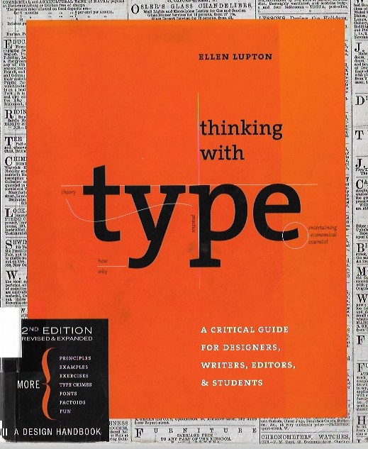

Thinking with Type (2nd Edition)
By: Ellen Lupton
(Week 1)
Golden Section
 |
| Fig.1.19: Golden Section. |
- a ratio that used in Western art and architecture for more than two thousand years
- formula for golden section [ a : b = b : (a + b)]
- side a is to side b as side b is to the sum of both sides.
- numerically, the ratio of golden section is 1:1.618
- used by graphic designers to create various grids and page formats.
Single-Column Grid
 |
| Fig.1.20: Single-Column Grid. |
- the simplest grid structure.
- it is mainly an large rectangular area taking up a large portion of the space inside a format.
 |
| Fig.1.21: Symmetrical double-page spread. |
 |
| Fig.1.22: Asymmetrical layout. |
- for book and magazines, it should be designed as spreads (facing pages).
- left and right margins become inside and outside margins.
- symmetrical double-page spread : inside margins are wider than outside margins, creating more open space to allow the eye to rest.
- asymmetrical layout : left margins is always wider than right margin, whether it appears along the inside or outside edge of the page.
Multicolumn Grid
 |
| Fig.1.23: Multicolumn Grid |
- made up by placing multiple columns within the format.
- provide flexible formats for publications that have various images and text to be presented on the page.
- more columns you create, more flexible the grid becomes.
- text and image can occupy a single column or it can be extent and not all the space has to be filled.
- work well with the discontinuous information and different types of info can be placed in different columns.
 |
| Fig.1.24: Horizon stretches across the page. |
- the page can be also divided horizontally by creating vertical zones with the columns of the grid.
- like the example shown above the area across the top can be reserved for images and captions, body text can "hang" from a common line.
- It is called as a hang line in graphic design while in architecture, it is known as a datum.
Modular Grid
 |
| Fig.1.25: Modular Grid |
- has consistent horizontal divisions from top to bottom in addition to vertical divisions from left to right.
- this modules govern the placement can cropping of picture as well as text.
- created by positioning horizontal guidelines in relation to a baseline grid that manage the whole document.
(Week 2)
This week, I have read about line spacing and alignment from the same book I read last week.
Line Spacing
- distance from the baseline of one line of type to another.
- also known as leading.
- default setting in most layout and imaging software : 120 percent.
- thus, line spacing of 10pt type will be 12pt.
- used by designer to create distinctive typographic arrangements.
- as leading increases, lines of types will become independent graphic elements rather than parts of an overall visual shape and texture.
Alignment
- there are four modes of alignment which is centered, justified, flush left and flush right.
- fundamental typographic act.
- carries unique formal qualities, cultural associations and aesthetic risks.
- combining different types of alignment in a design can produce dynamic and surprising layout.
 |
| Fig.2.21: Centered. |
- the lines of the length are uneven.
- place on a central axis.
 |
| Fig.2.22: Justified. |
- left and right edges are both even.
- makes clean shapes on the page.
- ugly gaps can occur
- avoid using when line length is long enough in relation to the size of type.
|
Fig.2.23: Flush left.
|
- left edge is hard and right edge is soft.
- a bag rag can occur and it will ruin the relaxed, organic appearance of a flush left column.
 |
Fig.2.24: Flush right.
|
- right edge is hard and left edge is soft.
- bad rags threaten flush right just like flush left.
- excessive punctuation will weakens the right edge.
Week 3


Typographic Design : Form and Communication
By: Rob Carter, Philip B.Meggs, Ben Day, Sandra Maxa, Mark Sanders
From this book, I have read about visual hierarchy which is an arrangement of elements in a graduated series, from the most prominent to the least prominent, in an area of typographic space. It influences the order which people will look at first from one point to another. The designer need to consider the relative importance message of each element in the message, the nature of the reader, the environment in which the communication will be read and the need to create a cohesive arrangement of forms within the typographic space when applying hierarchy. The study of the visual hierarchy is the study of the relationships of each part to the other parts of the whole. So, the elements which have similar characteristics will have equality in the visual hierarchy while the elements that have contrasting characteristics will enable their differences to take dominant and subordinate positions in the composition. Contrast that can be used for hierarchical arrangements included size, weight, colour and spatial interval.
Week 4


Typographic Design in the Digital Studio
By: David A. Amdur
According to the author, there are three types of terms : elements, qualities and principles of design. The word elements is used to describe the parts used in a design. The abstract elements of design included format, point, line, texture, shape, space, colour, and others. These terms are also known as the formal elements because they describe the fundamental parts that are used to form any visual design, from a building, to a picture, to a letter character. Qualities are adjectives that are used to describe the "feel" of the elements. For example, the use of word "rough"or "smooth"and "organic" or "geometric". Principles of design describe how the elements work together. The use of design principles give the designer a way to identify, think about and speak to others about how a design is working.


Basics Advertising 02 : Art Direction
By: Nik Mahon
For this week, I have read about the use of typefaces in advertising. According to the author, it is the chance to give the words visual expression when using the typefaces for headlines, streamlines, slogans, body copy, and any other occasion when the words appear in print. Most of the typefaces can be categorised into one of three types which is serif, sans serif and script faces. Every typeface has its own personality which can emphasising the advertising message with a tone of voice, an attitude, a mood, a visual style or the overall theme of the campaign itself. Each of them can also express mood and meanings depending on the context in which it is used. For example, its size, colour, juxtaposition, and relationship to other elements within the advert. The designers require to have a good understanding of how visible language can conjure different feelings and emotions across their target audience when using typography to strengthen their advertising message. Good typography in advertising doesn't want to be just draw the attention itself but facilitate communication of the message and should not distract the audience to understand that message.
Comments
Post a Comment