06/06/18 - 28/06/18 | Week 11- Week 14
Yeoh Xiao Shi (0331577)
Design Principles
Final Project - Billboard Inspiration
INSTRUCTIONS
FINAL PROJECT
For final project, we were required to study and investigate two or more billboards to find what are the design principles being used as well as what we had understand from the billboard. I have a hard time to start this project as it is very wide and it can be anything. I started it by choosing the billboard that I wanted to use in this project. The first billboard I chose is the grab car advertisement with a image of coffee cup in the middle and the another one is the property advertisement with the image of houses surrounded by trees.
 |
| Billboard chosen. |
 |
| Billboard chosen. |
Once I selected the billboard, I try to understand the design principles being used in the billboard. The first thing I noticed is that most of the billboard will choose to use contrast colour. Based on my research, use the colours which is high contrast in both hue and value like green and white will made the billboard viewed well from the great distances. In contrast, the colours which is low contrast tend to blend together and obscure the message. Besides that, hierarchy is also important to apply in billboard. The messages or informations that is trying to convey through the billboard are more prominent. We need to know what the main thing that we want the viewers to look at first then move on to the second one. We will need to use the guidelines to first capture the viewer's attention with a clear and single point of communication.
In addition, placement also being used in the billboard. Designer need to be good in placing the information and the content so that viewer can understand it faster. Message should not be overlay as the viewer will pause and took time to pick up the information. Other than that, I also noticed that emphasis also can be seen in the billboard. As the property billboard showed above, there is a phone number with the website are being placed at the pink background. It does show emphasis as it stands out to capture the viewers attention.
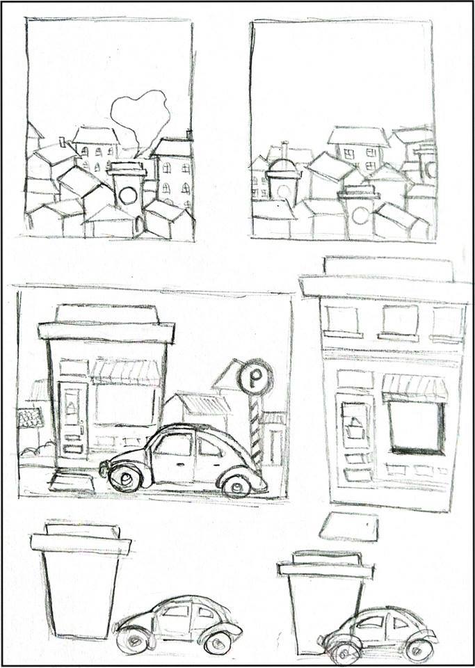
After studying the design principles , I started to find some inspirations from the elements that can be found in the billboard. The elements I decided to use are the coffee cup, houses and the car. Then, I move on to sketch by using the elements I chose.
 |
| References. |
 |
| Sketches. |
After showing my sketches to both of my lecturers, I realised that I misunderstood the instructions for this project. I thought we just have to come out with an artwork by applying the design principles and take the elements that we found from the billboard as an inspirations. I faced difficulties to sketch my ideas as I don't really understand the requirements and I felt lost. So, I walked around to look at my friend's work and ask for consultation from both of my lecturers. At last, I got to know that not only finding the design principles and elements in the billboard but I also need to study and understand the messages from the billboard. The final outcome of our artwork should be interpret the message that we get from the billboard and take it as the inspiration.
Then, I move on to study the two billboards chosen again and try to figure the messages as well as information from there. It took me a lot of times to think how to related both the billboards and one of my friend have actually gave me a helpful feedback. He told me that the window glass of the houses in the property advertisement is actually made from recyclable glasses and he asked me to do more researches for that.
I went to the property website through the link provided in the billboards and started to gather some informations there. I got the information that they stay true to key development principles in sustainability and they tried to maintain the goodness of the land and its natural surrounding while enhancing the existing environment by fusing nature to the towns and neighbourhoods. After that, I tried to connect this concept to another billboard which is the grab car advertisement billboards. There is a sentence on the billboard " Grab lebih, Kopi lebih " & " Tebus Sekarang" which means if you take more rides on grab you will get more coffee as reward. By coincidence, I found out that grab had cooperate with Starbucks for this event as you ride grab you will get rewards on Starbucks. I tried to figure it more about that and I realised Starbucks had actually also promoting sustainability. I gathered all the informations I have and came out with the concept of sustainability for my final project.
 |
| Analyse the billboard. |
 |
| Analyse the billboard. |
 |
| Research 1. |
 |
| Research 2. |
After deciding the concept, I started to find some references and do some sketches on it. I wanted to combine all the activities that we can do to promote sustainability in one piece so I listed it out and try to arrange it in the sketches. Later on, I transferred my idea to Adobe Illustrator and draw it digitally.
 |
| References. |
 |
| Sketches. |
 |
| Process of drawing digitally with Adobe Illustrator. |
 |
| Progress. |
 |
| Progress. |
 |
| Final Outcome. |
 |
| Final Outcome. (Printed version) |


Comments
Post a Comment